

This project required I create a full book redesign of a public domain story. This included the front and back cover, spine, page layouts, chapter breaks and more. I chose H.G. Wells' War of the Worlds.

Cover
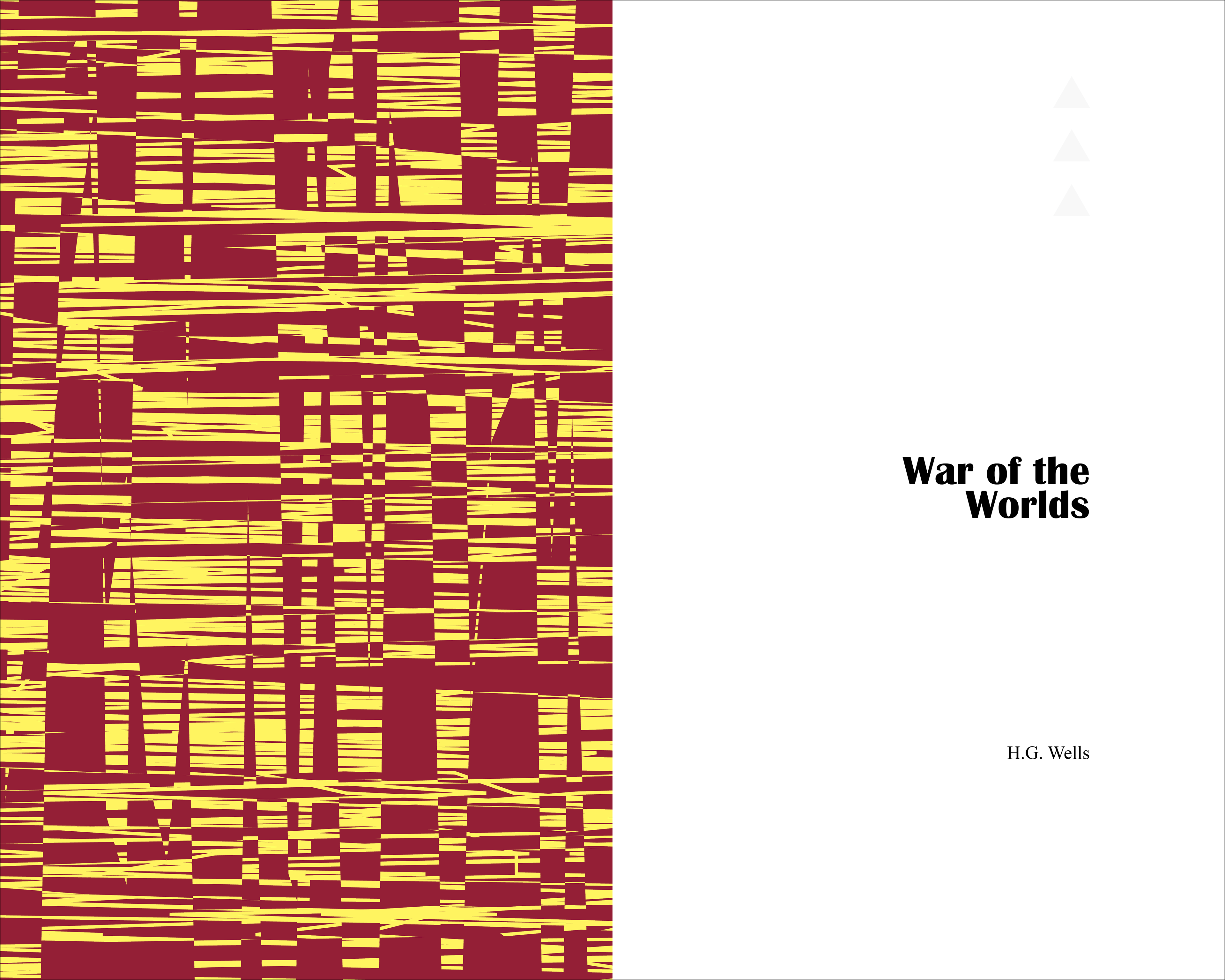
During my research I found that a vast majority of alternate covers for War of the Worlds involved the symbolic tripod from the story. In order to create something fresh, I aimed for a new look entirely. I used Britain as the predominant shape, with a radiation symbol shaped attack plan on London, a key location in the book. I also focused a second attack plan on Edinburgh on the back cover. Making the land red was a callback to the river running 'red with blood'. I chose the font Britannic as it had a classical feel to it and representative of the time period. Plus it's name is Britannic, sitting nicely in my overall theme.
Interior
The endpaper for the book was a glitch effect using the red and yellow from the cover. The book is rather grim so I wanted a strange, uneven pattern to get the reader in the right mindset for the book. The title page is minimal to keep the page clean. The three arrows from the spine, a callback to the arrows of the radiation symbol, are also present at the same location they will be displayed on chapter breaks.
Layout
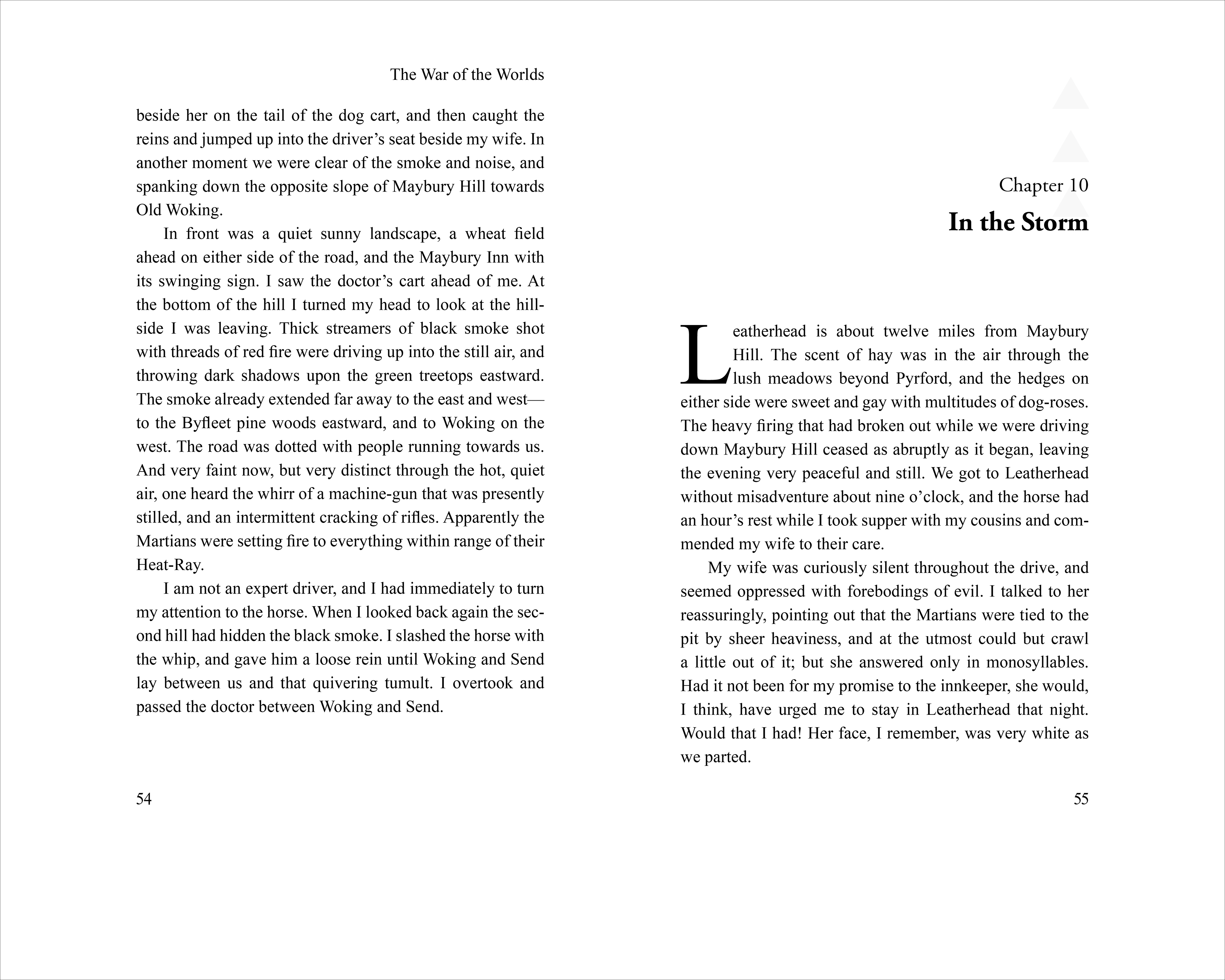
The layout for the book uses the golden canon ratio for the text position. Above the text on the left page is the title, while on the right page is the author. On blank pages or chapter breaks, these elements are removed. Page numbers are aligned with the outside border of the body copy at the bottom.
Chapters always begin on the right page. If the previous chapter ends on the right page, the next chapter skips the following page and then begins. These extra pages are left completely blank.
War of the Worlds features two books in the story. The book markers are their own spreads. They follow the same layout as chapter breaks, without body copy.