This project was a team-based job that required a diverse design skill set. My team consisted of four designers, myself included. We created Varial, a skateboard outlet serving the western United States. The four of us created a company that focused on serving its local communities and aimed to provide fresh gear, apparel, and energy products.
Company Design

Company History
Varial was founded in 1994 by Tanner 'The Wolf' Woodrow following his spectacular first place finish in the inaugural season of the X Games. Tanner's quick rise to fame put plenty of eyes on him. With his new following, Tanner decided to open a skateboard parts store, Varial. The business proved successful in its early years, leading the company to expand into other products; first apparel, then accessories, and eventually to energy drinks and chews.

Brand Design Process
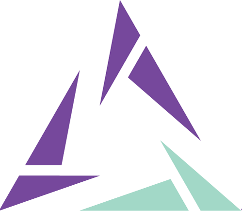
With the company's core values and audience in place, we were ready to create a logo. Looking back, creating the logo for Varial turned out to be one of the most challenging aspects of this entire project. Our group proceeded with sketches, rough digital ideas, and general brainstorming to get us rolling. We arrived at an initial concept. After some deliberation I raised some concerns with my teammates on inconsistencies between the branding approach and the companies mission statement. We agreed as a team to go back to the drawing board. This resulted In a new concept that eventually turned into the final logotype that was used for the project.

Next was color choice. I felt the company needed a bright and vibrant color palette to connect with Varial’s youthful audience. The team agreed with my conclusions and I created a three color primary palette and four color secondary palette.
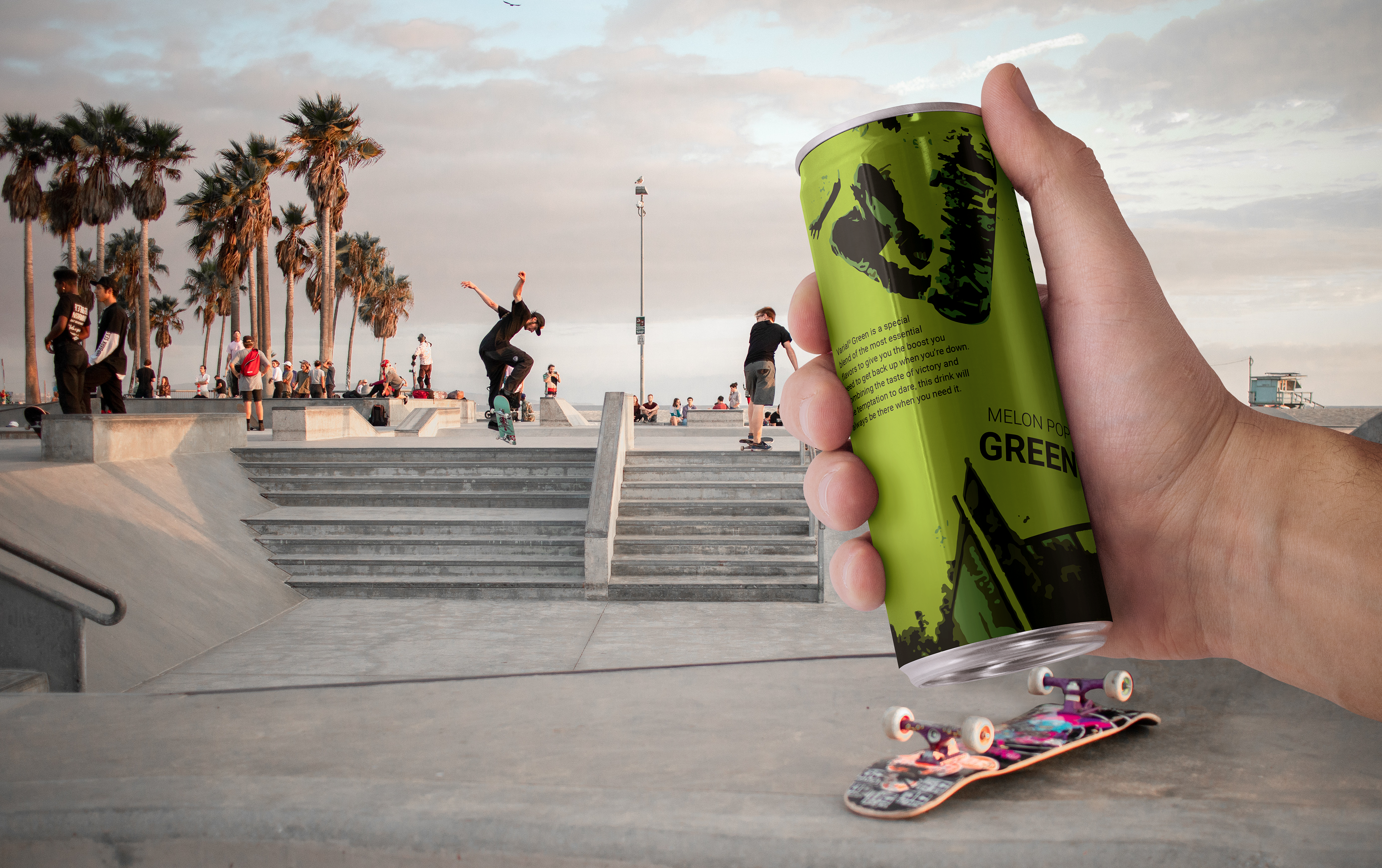
Product Design
With the company's design system created, we began to work on the products. These ranged from apparel to skateboards; from energy drinks to backpacks. One of the first products I designed laid the groundwork for what became the company's primary product design system.
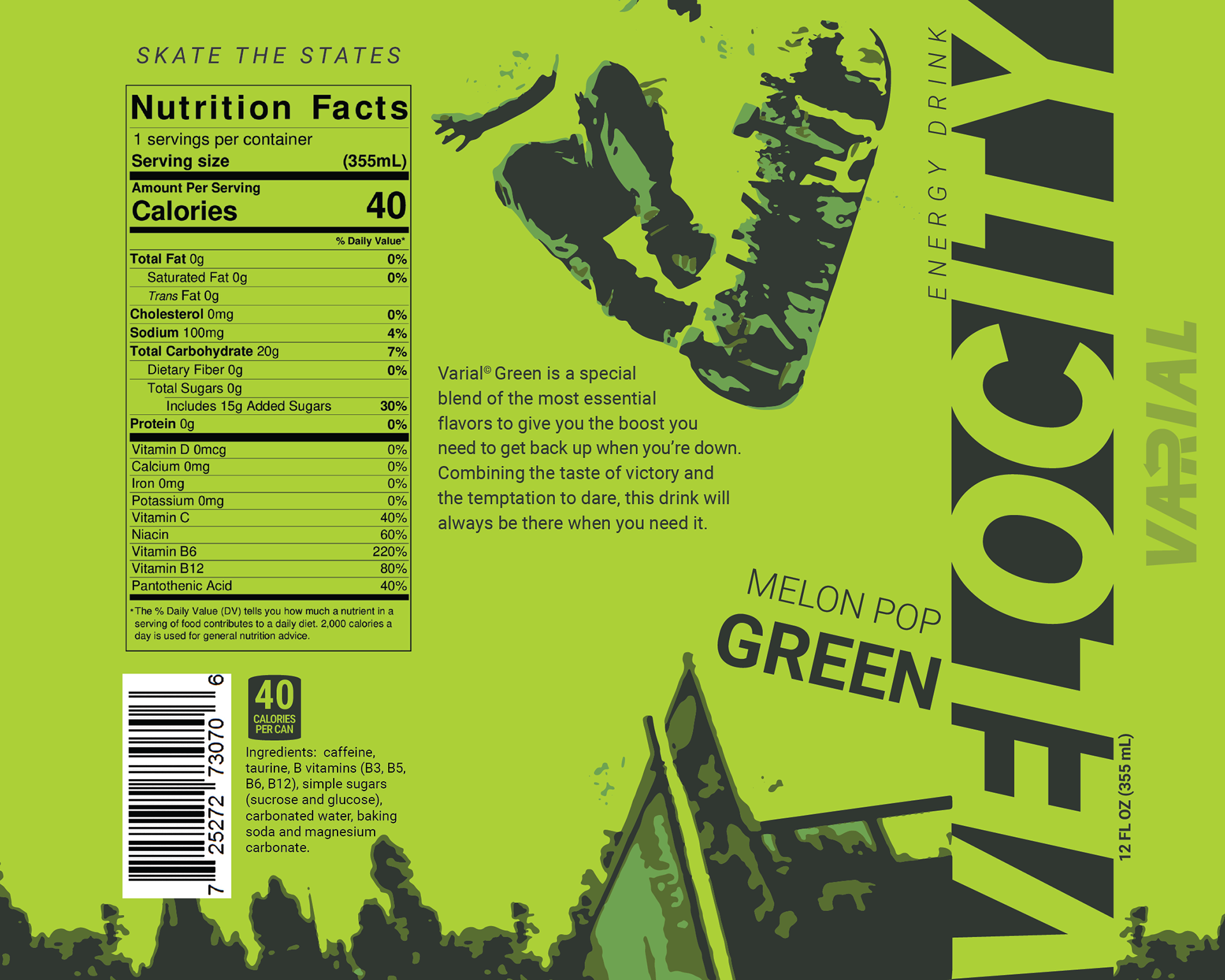
I began by creating an energy drink. I felt an energy drink would be a solid starting piece due to the amount of imagery and type that have to work together on a single item. I designated the 12 oz 'skinny can' as my base for the product line. My goal was to demonstrate ‘energy’ while reinforcing the corporate brand. This manifest with a skateboarding figure stylized with a three-color image trace. The figure was then recolored to match the color scheme of the bottle. Additional text was added such as the flavor, product line name, tagline and more. After plenty of minor tweaks, the bottle design finished as such.
The energy drink was quickly approved by the team and we used it as a reference when designing other products. The energetic imagery with carefully placed text served as a reminder of what the company strives to project to current and potential customers. Two other designs, one red and one blue, were also created to establish a small product line.
Skateboards
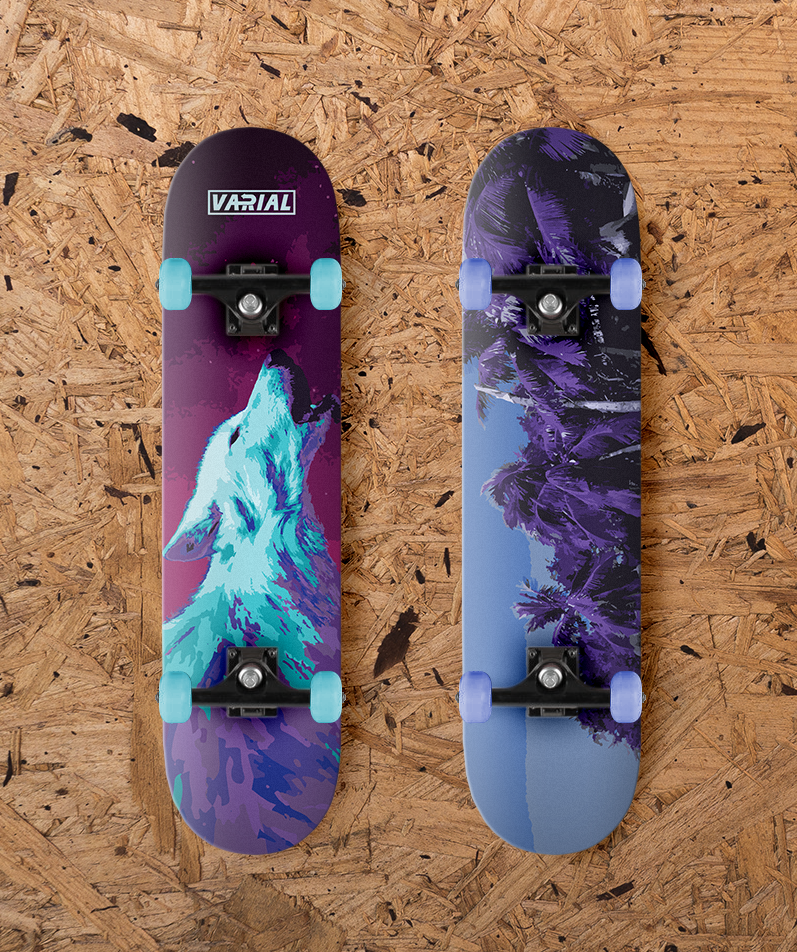
Since Varial is a skateboard company, decks were easily the most important product for the company. The creation of these boards was split up by board type. I was assigned the popsicle deck shape. Since popsicle boards are the most common board type, and skateboards are the company's specialty, I knew I had to create a strong design that highlighted the company's core values.
I wanted to design a skateboard deck that was true to the company and differentiated from the competition. Once again I employed the color trace to these boards, however to make them more visually interesting I applied some new techniques.
For the board on the right, I used a much higher color process, using 16 colors rather than only three. This greatly increased detail while still allowing color manipulation and a more authentic appearance.
The board on the left used two sets of six color traces. I used an image of a white wolf howling to pay homage to the founder's nickname of "The Wolf". I adjusted the hues to the cooler side of the color wheel, while using the shadows as an opportunity to transition from a light blue to a deep purple. Next I extended the neck to form a mountain like shape to the board. I finished by applying a starry night sky, tracing it, and applying a warmer set of colors to contrast the other side of the board and adding the logo at the top as a finishing touch to fill out the image.
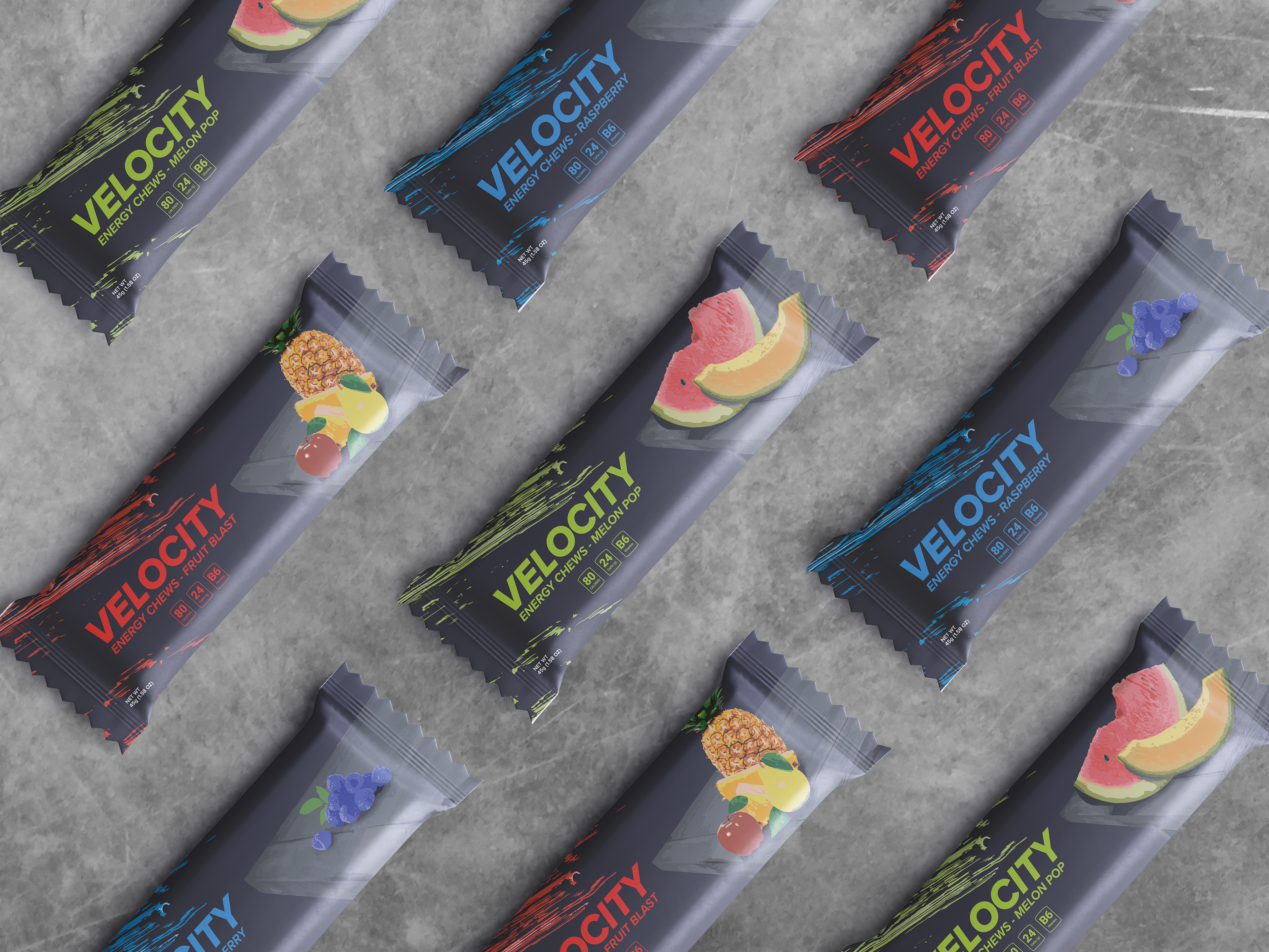
Gallery
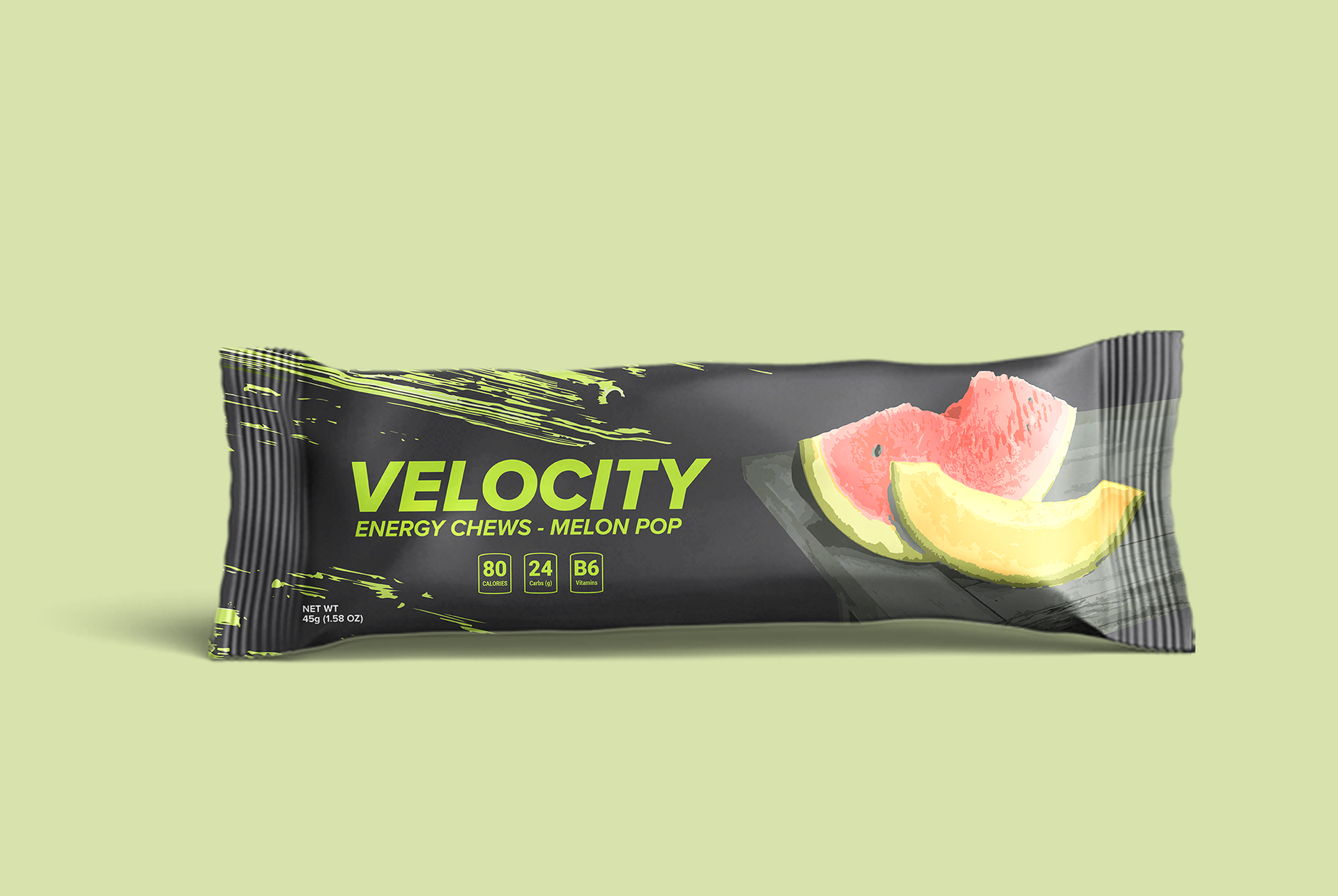
Energy Chews
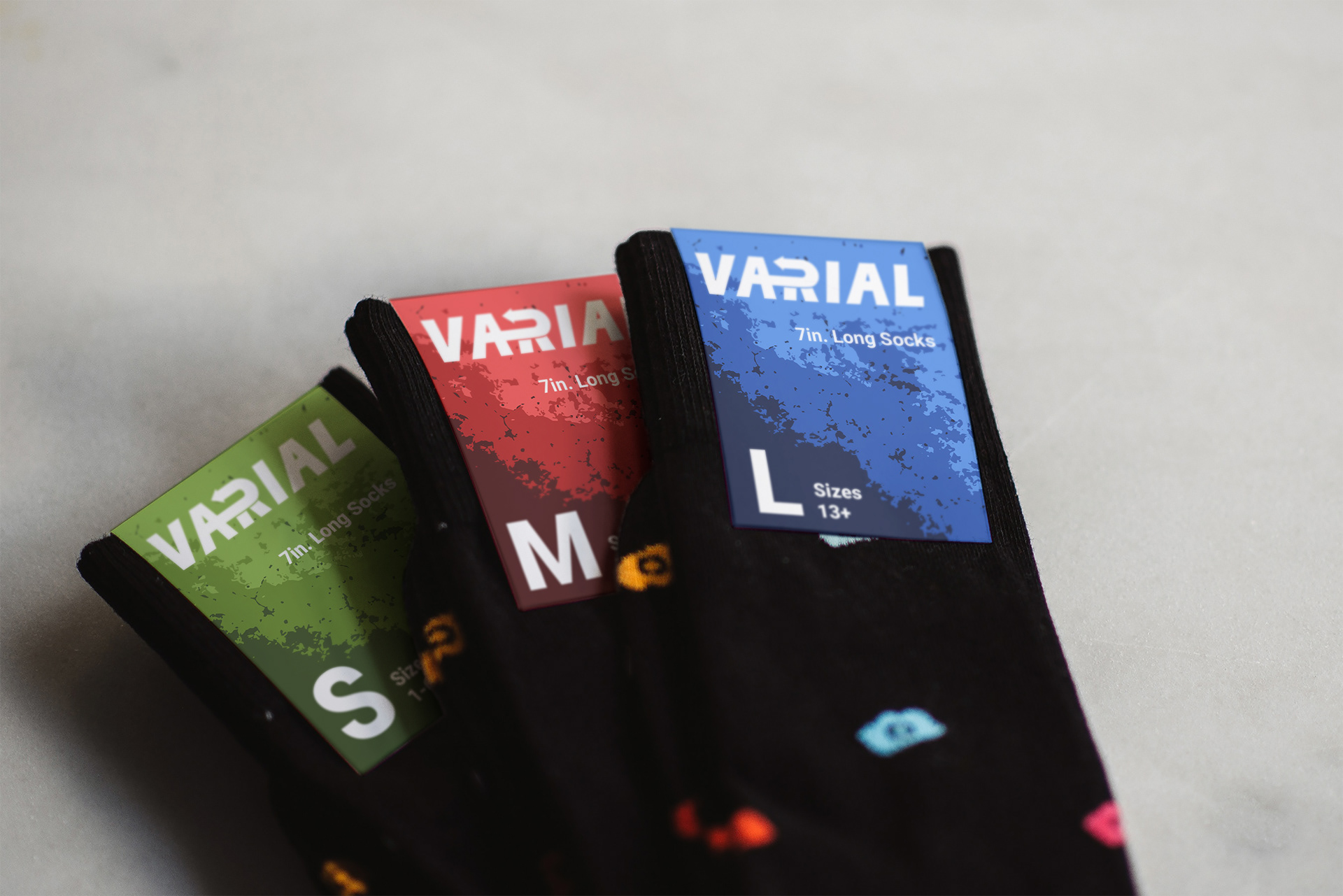
Sock Labels
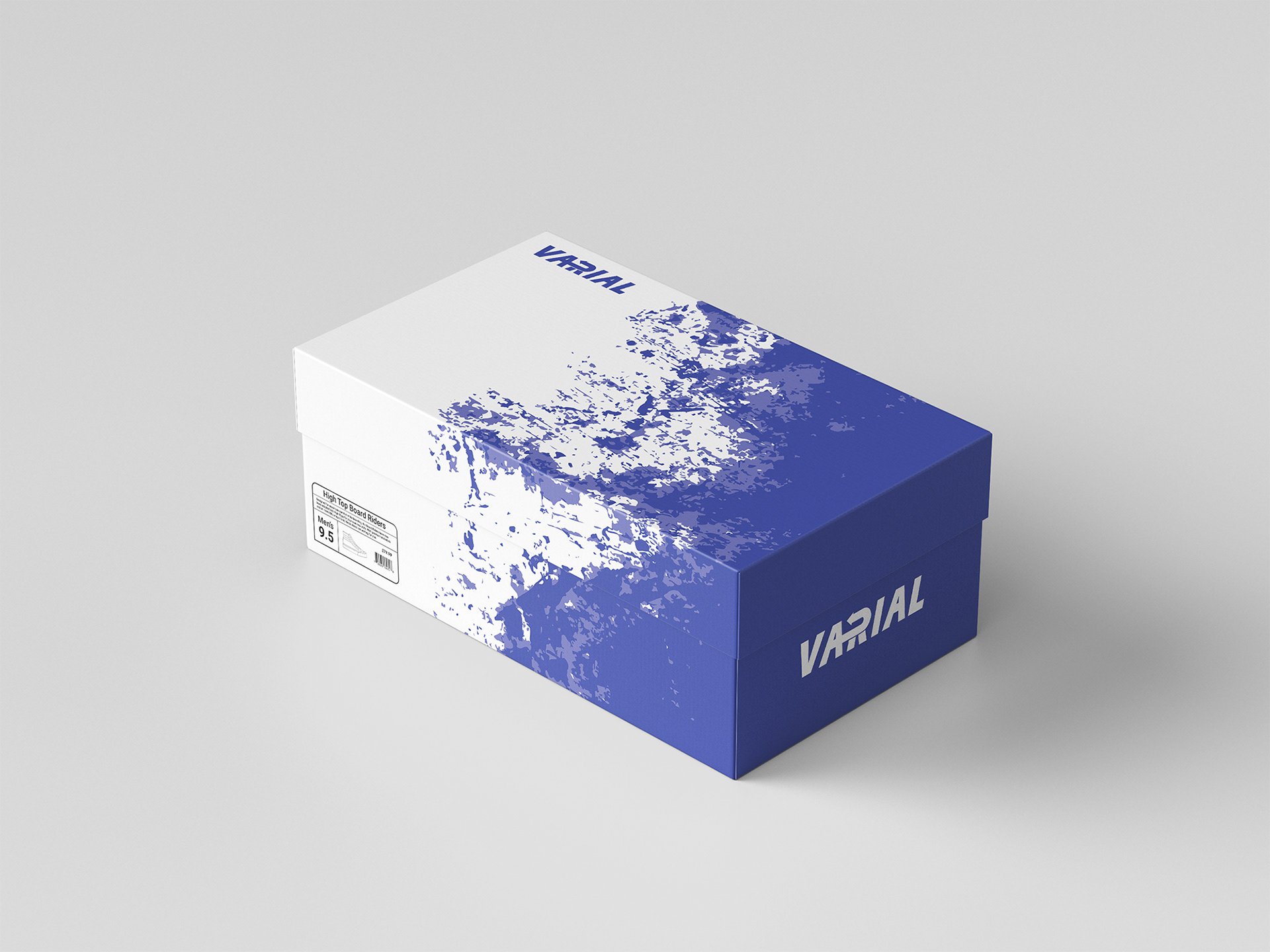
Shoebox


Hats
