I was brought onto the Turtle Beach team as a contractor in November of 2020. After four months, I was officially hired and joined the creative department. Here's a selection of my favorite pieces while working at Turtle Beach.
Packaging
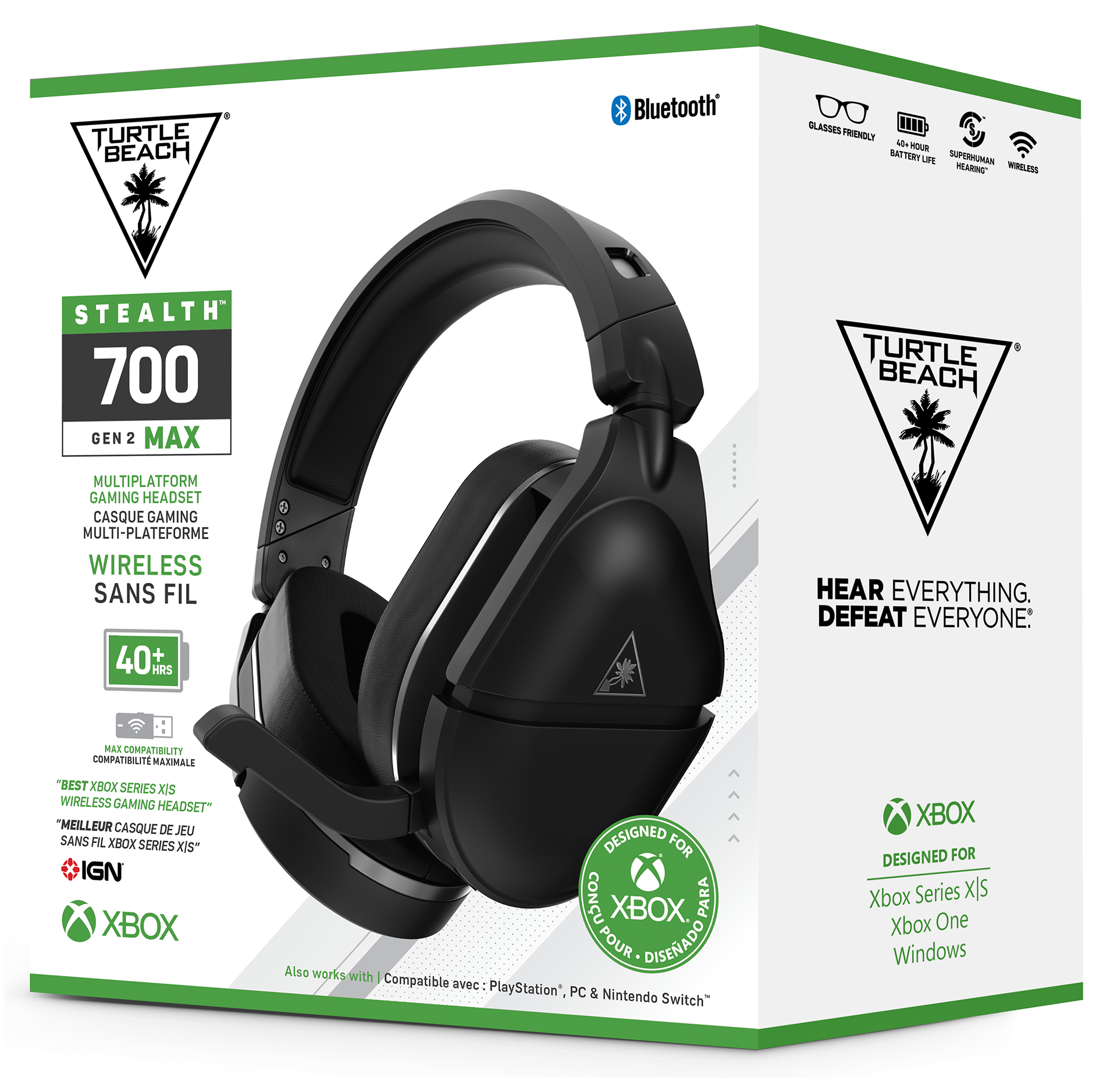
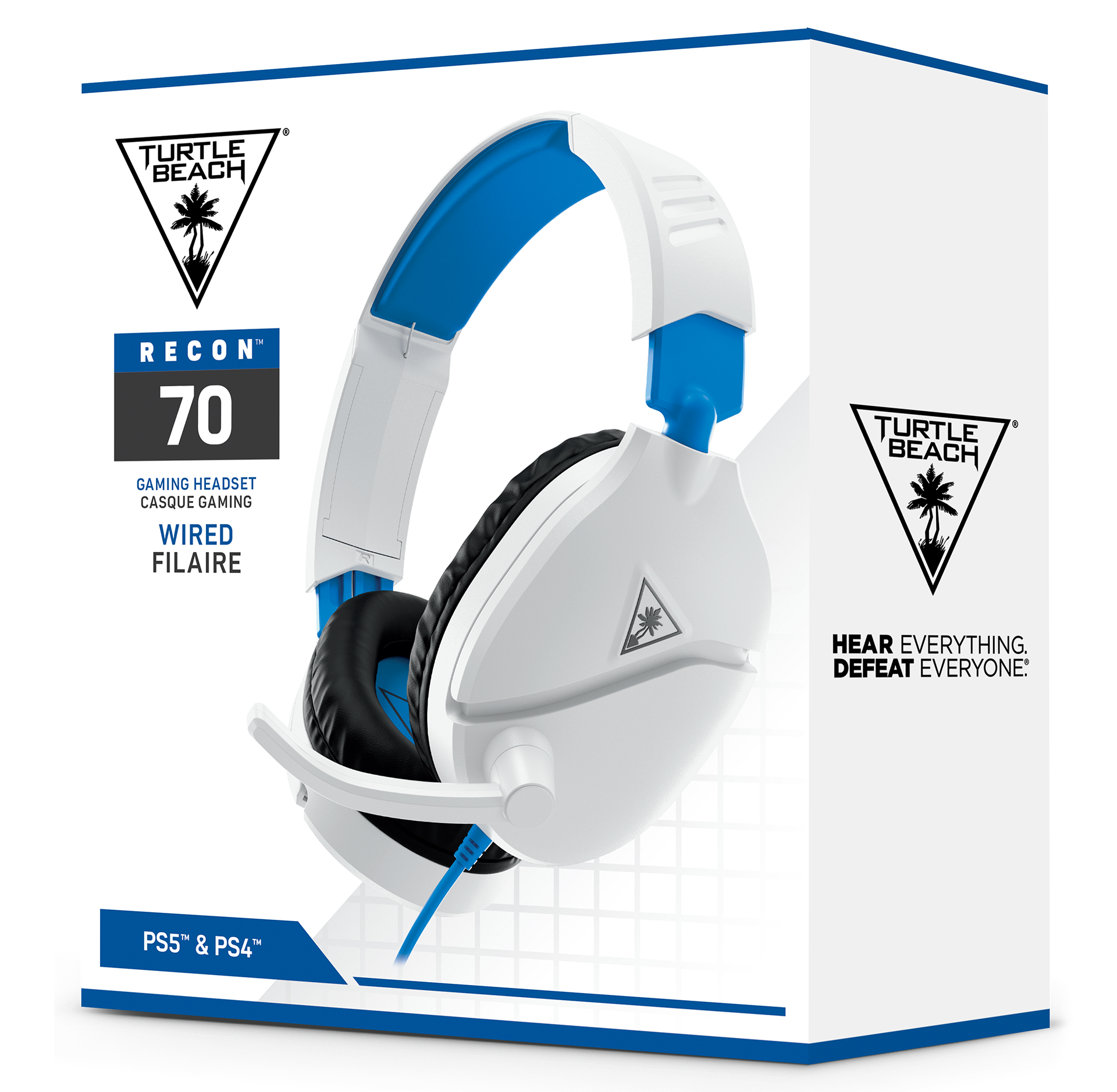
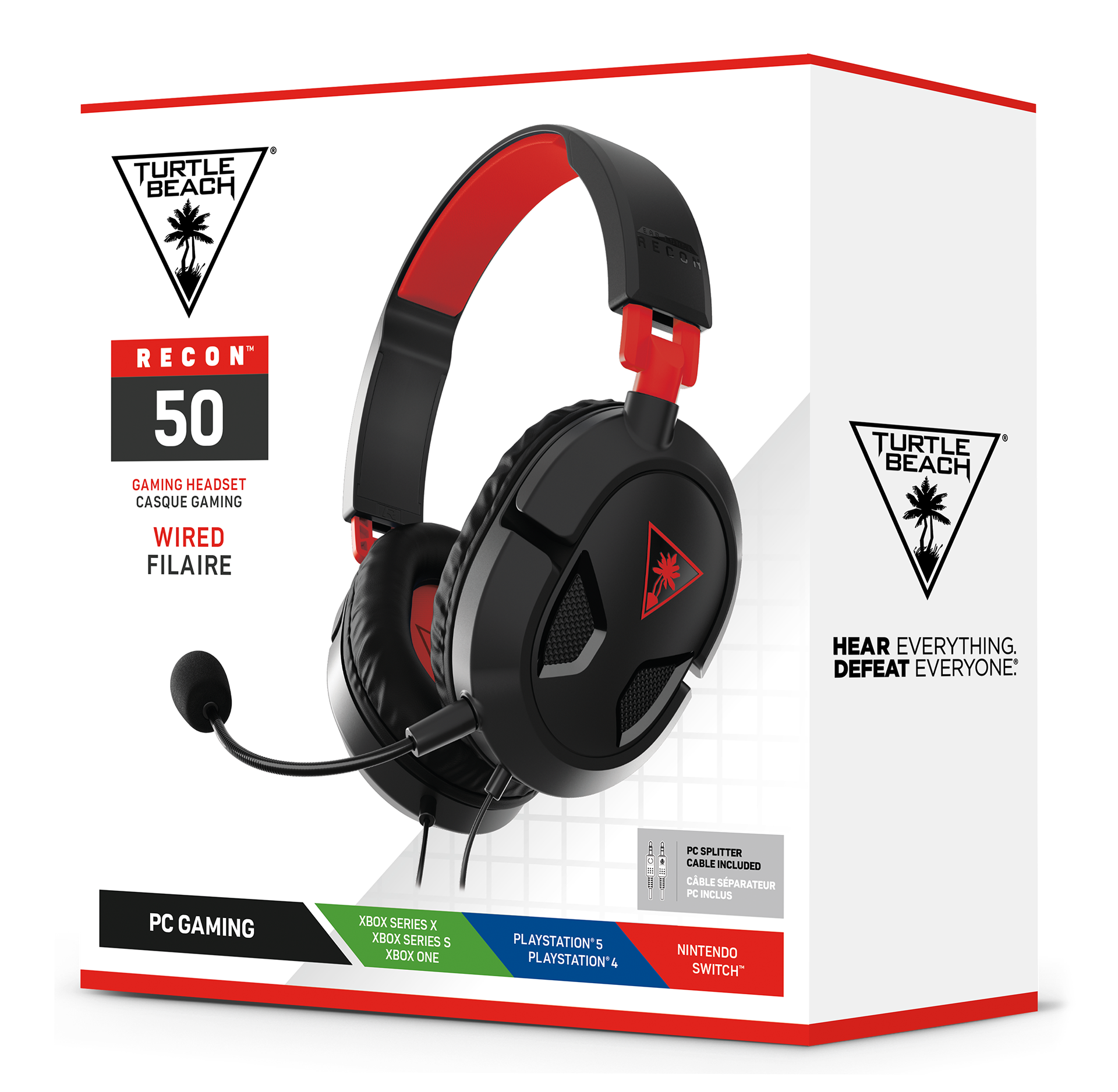
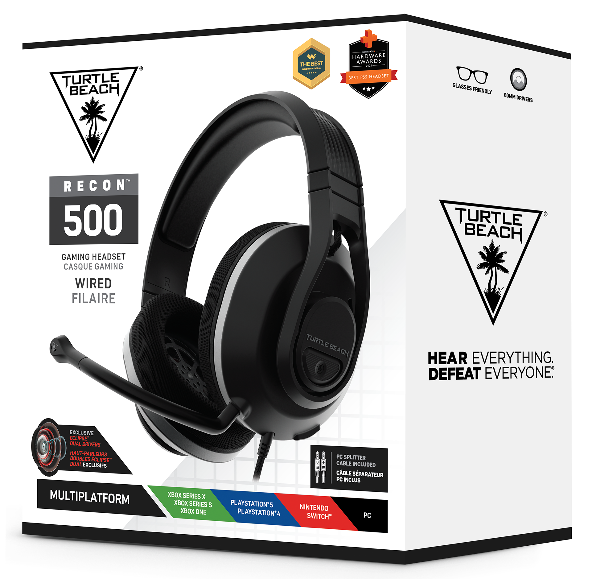
Sustaining Packaging
While working at Turtle Beach, we transitioned from gray packaging to white. Although I did not get to choose the design, I worked on much of the production of the transition. Here are just a few of the boxes I worked on during the process. In total, we converted roughly 100 different packages.
Quick Start Guide
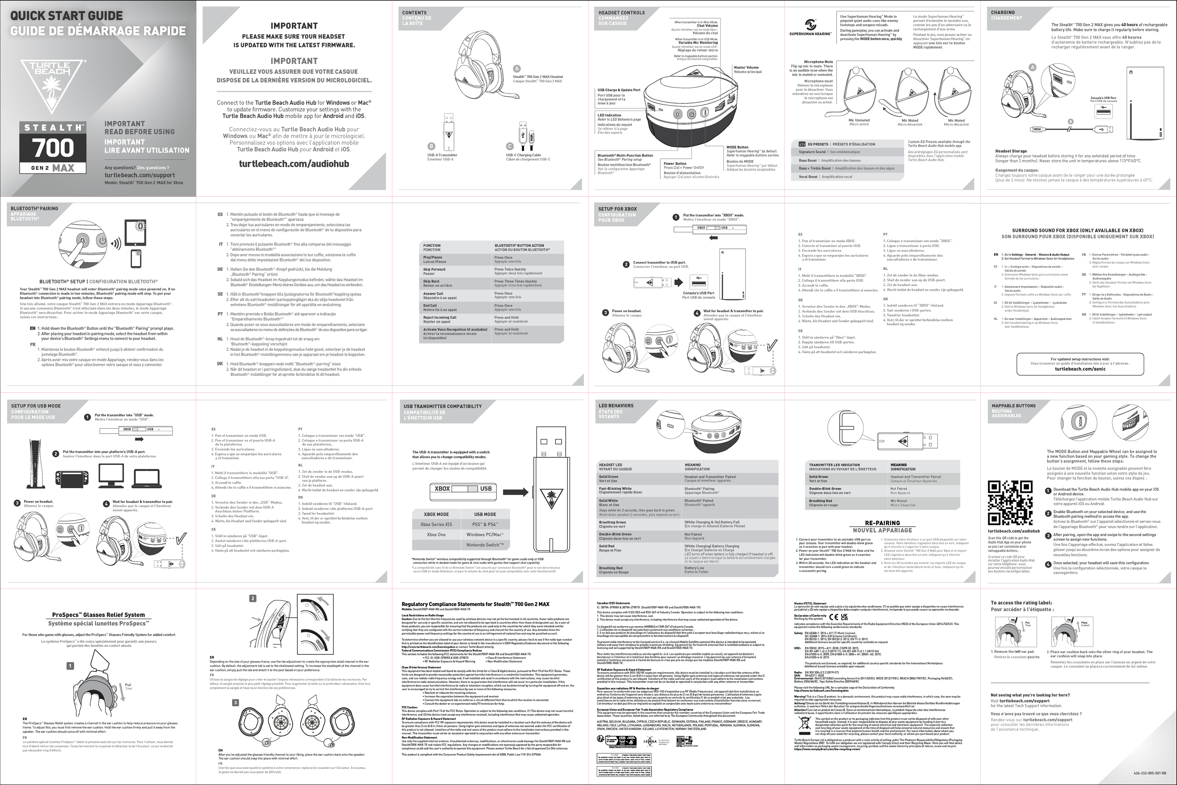
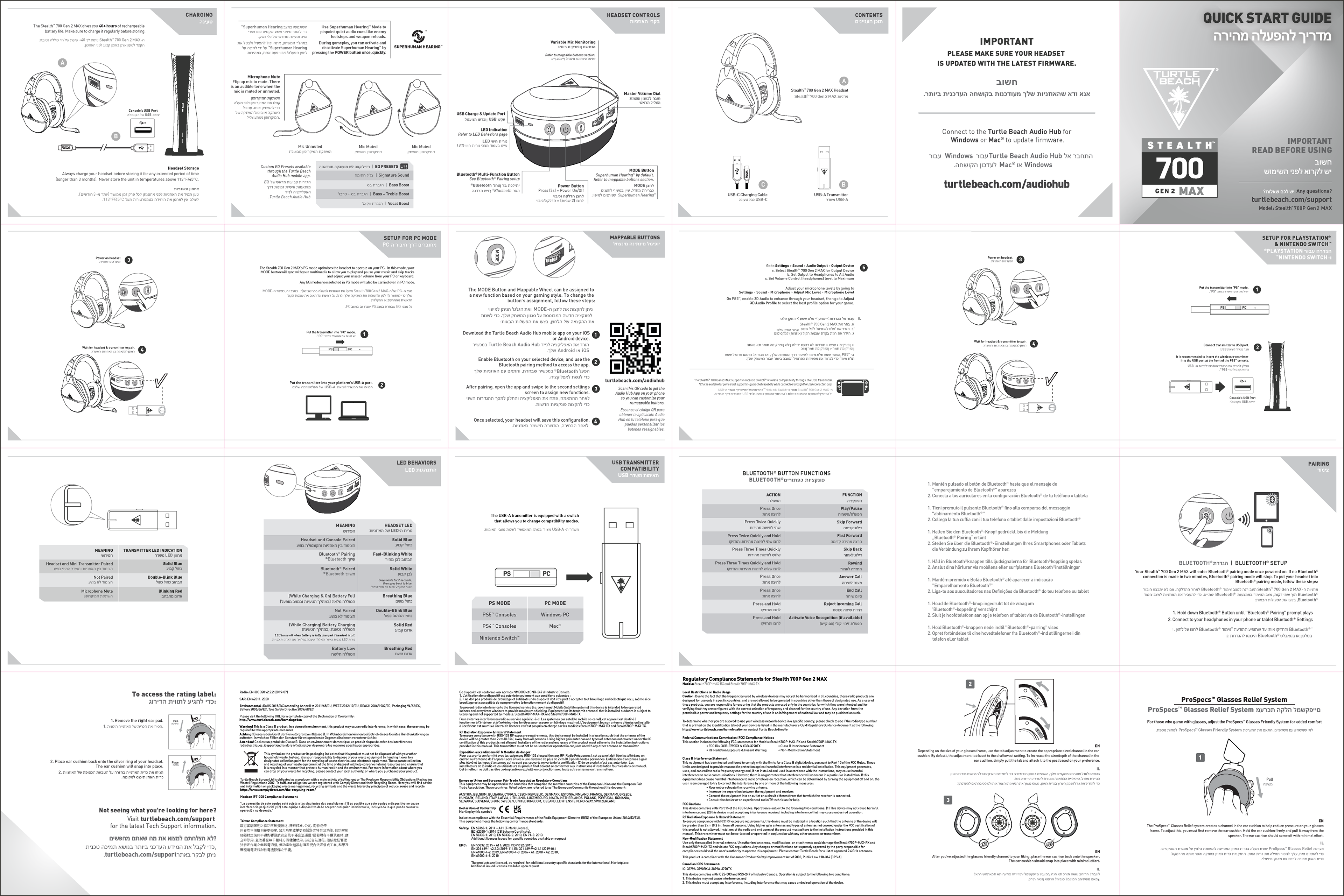
All Turtle Beach products came with a Quick Start Guide (QSG) in the packaging. These technical documents were designed to aide the user in proper product usage and care. They also include all the regulatory marks, foreign and domestic, meaning they were updated constantly. I helped create and maintain many of these documents.
Each document, while similar, required multiple pieces. Line art of the product and any additional contents were needed. The designers were also required to consolidate the given copy to as few pages as possible to keep costs down. Lastly, as mentioned earlier, regulatory marks were updated every time the product was approved for sale in a new country.
While there was a universal QSG included in all packages, some countries needed their own full QSG. A Hebrew example is provided, showing the difference between what would be found in the box and these localized web QSGs. Hebrew and Arabic were the most complicated localized QSGs as they required the designer to rework the entire document to read from right to left. While tedious, this was a great example of the necessary global modifications.
Print Graphics
Sell Sheets
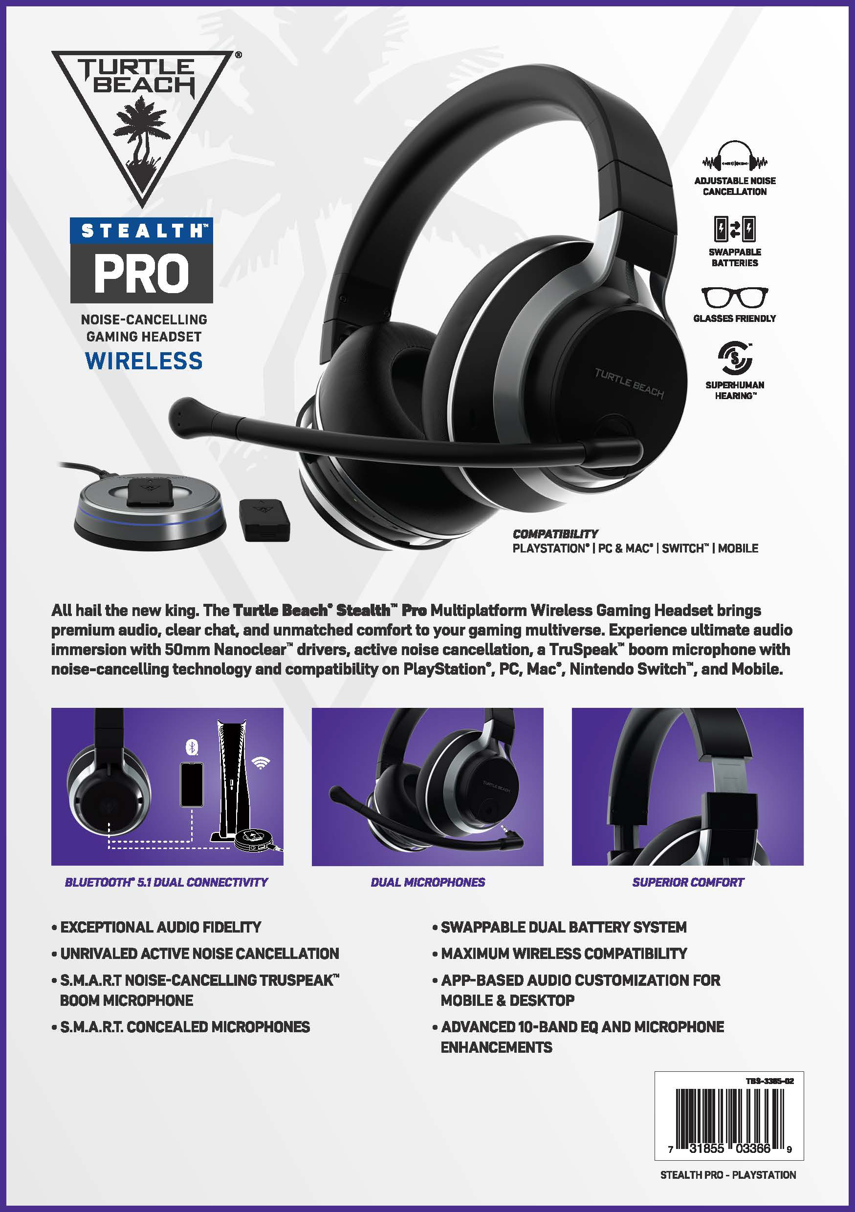
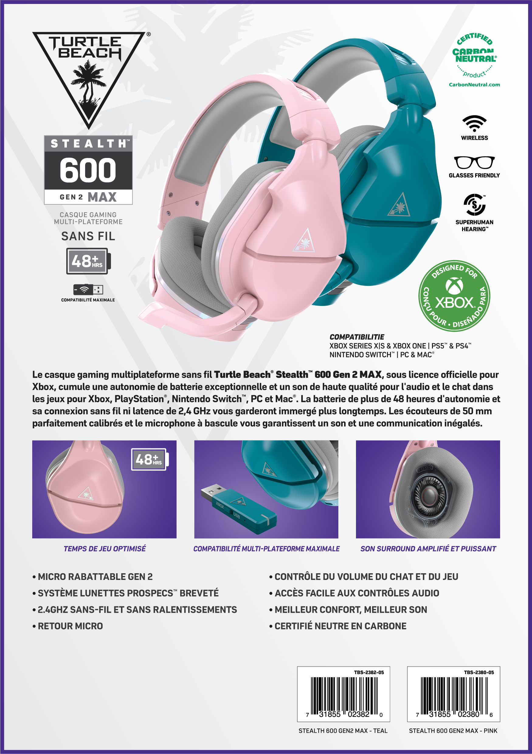
Sell sheets were used to aide salesmen sell new products to potential merchants. While they were made for US and EU, French was the most common language I worked on. Each document was consistent in layout and design, tailored for each product.
The main difficulty with these sheets was ensuring the French is being implemented correctly.
Step-Up Charts
Along with sell sheets, many retailers asked for us to create 'Step-Up Charts' of our products to aid them in properly understanding each headsets' features. This meant each retailer would receive a custom sheet showcasing the products that they stock. It often required heavy forethought, as the copy is often dense and requires proper spacing and alignment to ensure they are easily legible.
Apparel
One of the uncommon tasks I was given was to create a line of t-shirt designs for the company. I chose to create a computer-like graphic look of our products, and added Japanese lettering and a touch of English to round out the designs. The products were then cropped to create a more dynamic and interesting appearance, and finally were applied in black & white to prevent crowding the design.
Digital Graphics
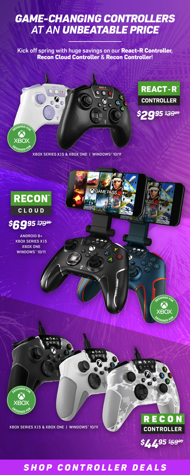
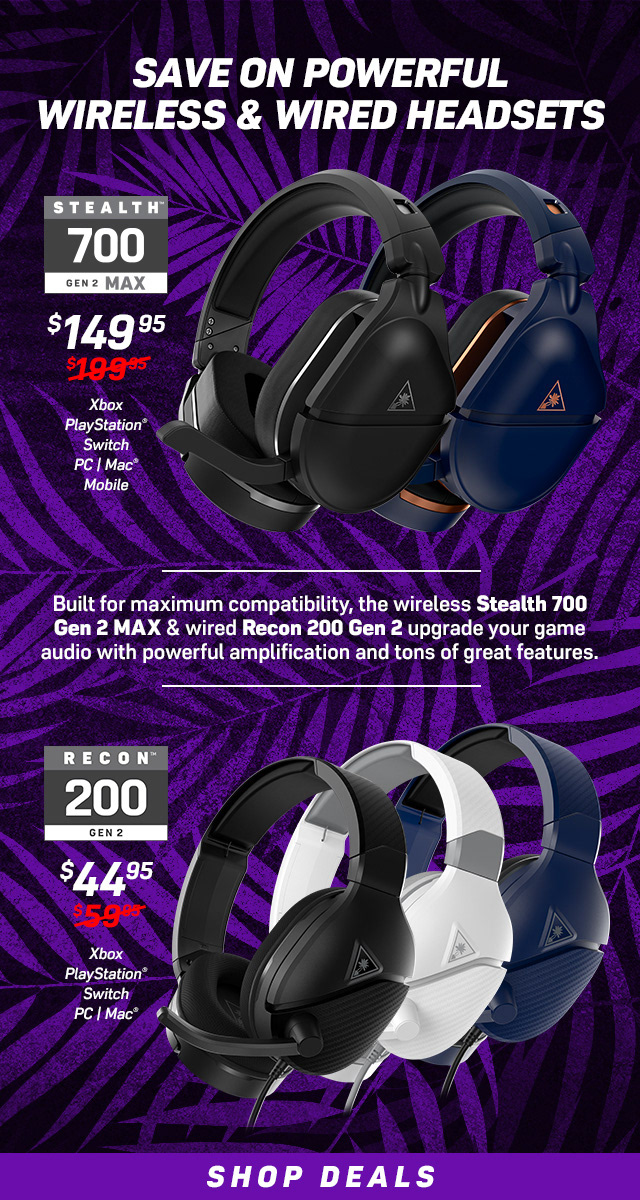
Emails
Emails, while similar to web graphics, had a variety of separate requirements. Emails were often .gifs to help show more information within a limited space. Here's two examples of the emails I made, one that focuses on product renders while the other focuses on lifestyle photos.
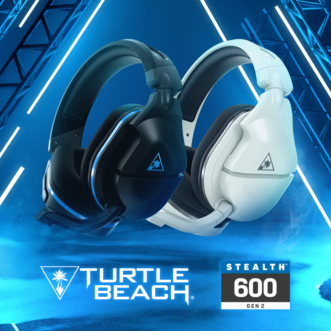
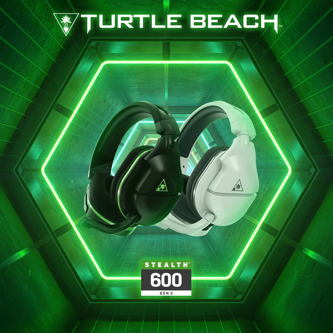
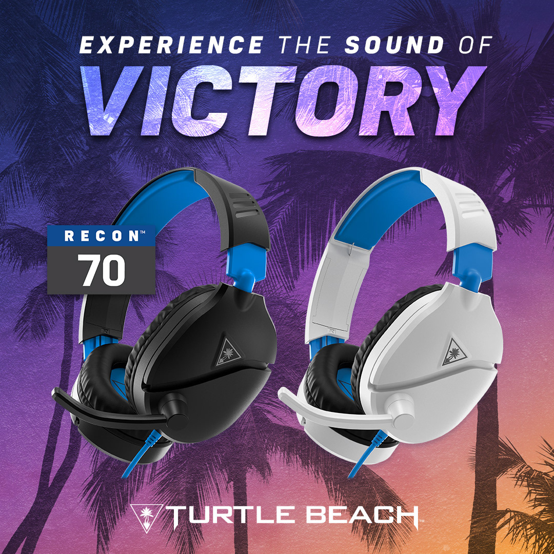
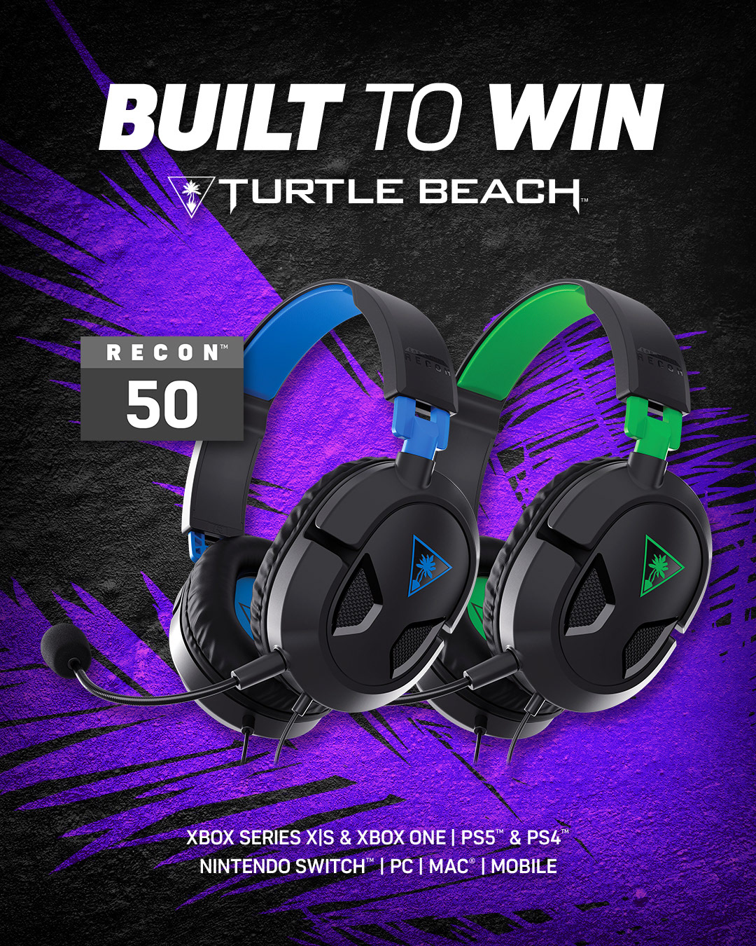
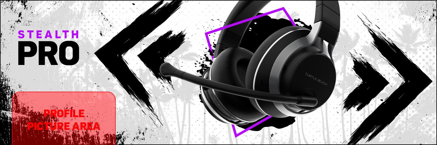
Products
As with all product-based companies, Turtle Beach made ads based around their products. While every ad would be visually different, featuring different products, sales, events and more, they all had a consistent feel. These ads were a request that aimed to focus solely on the headsets and a 'neon' setting.
Influencers
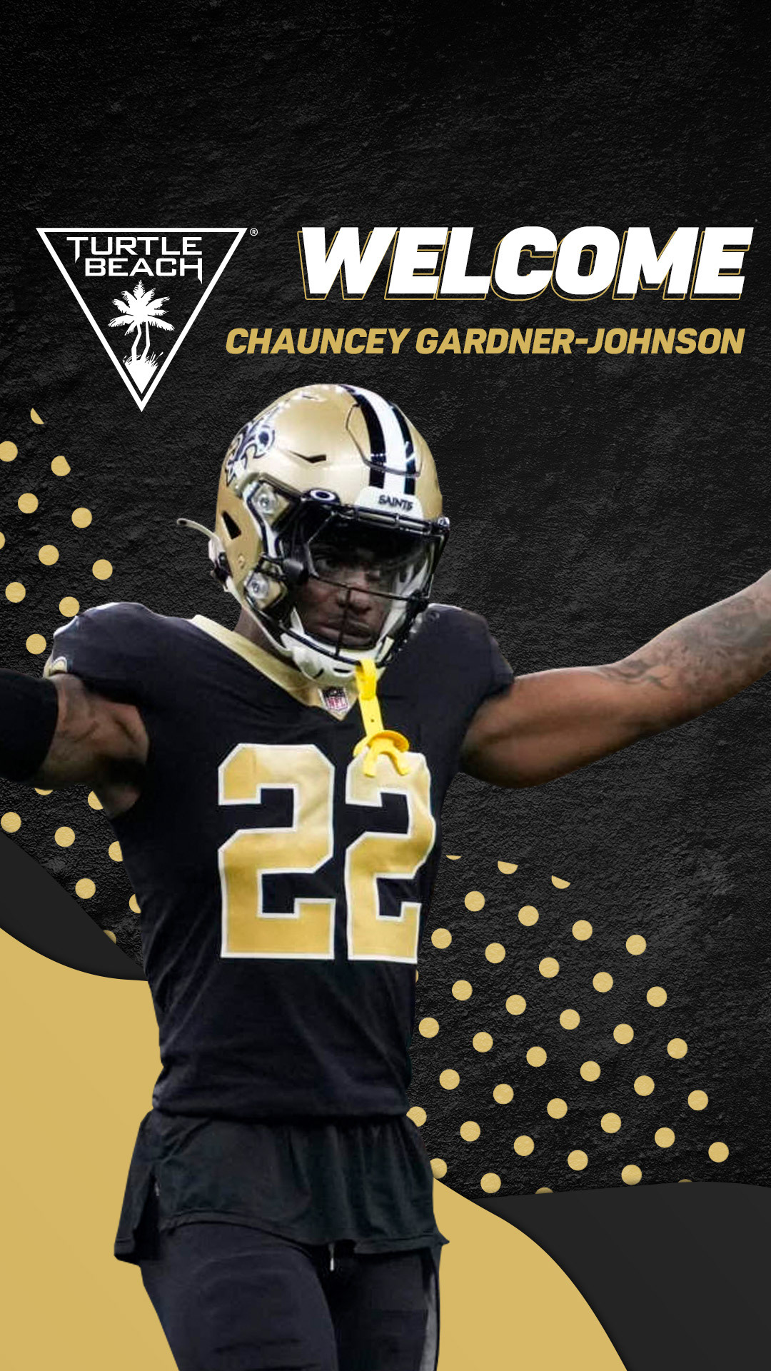
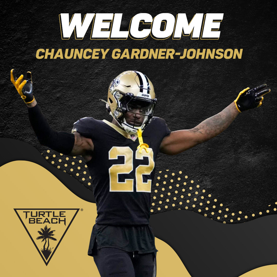
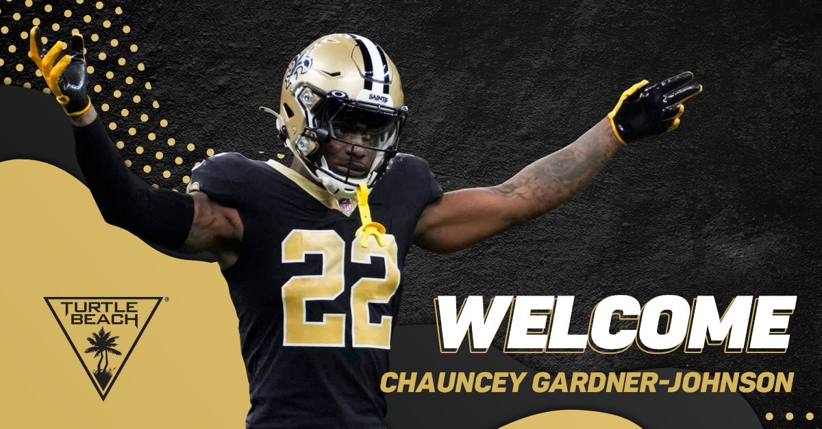
Turtle Beach has partnered with many influencers, including Dr. DisRespect, Adept, Josh Hart, and many more. Whenever a new partnership is announced, I would be assigned to create social media graphics to help with the news. Here is the social set I created for Chauncey Gardner-Johnson, an NFL safety currently playing for the New Orleans Saints.



International
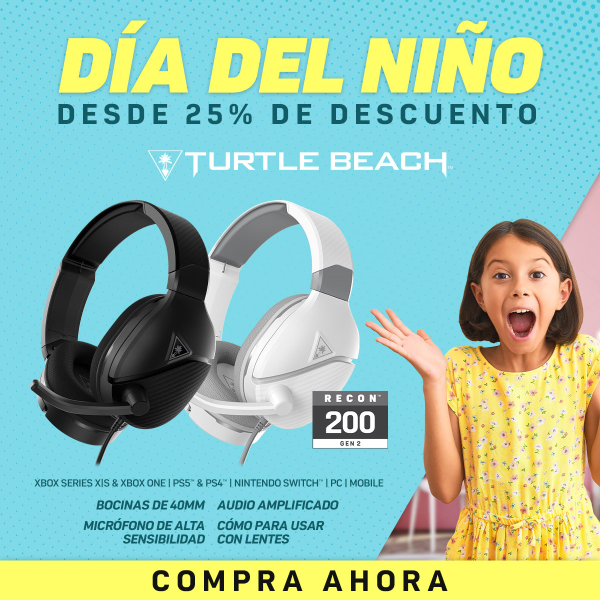
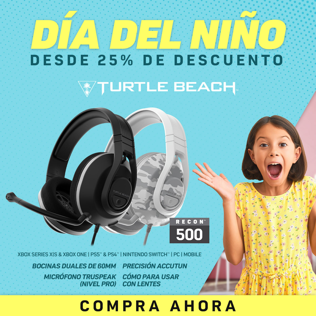
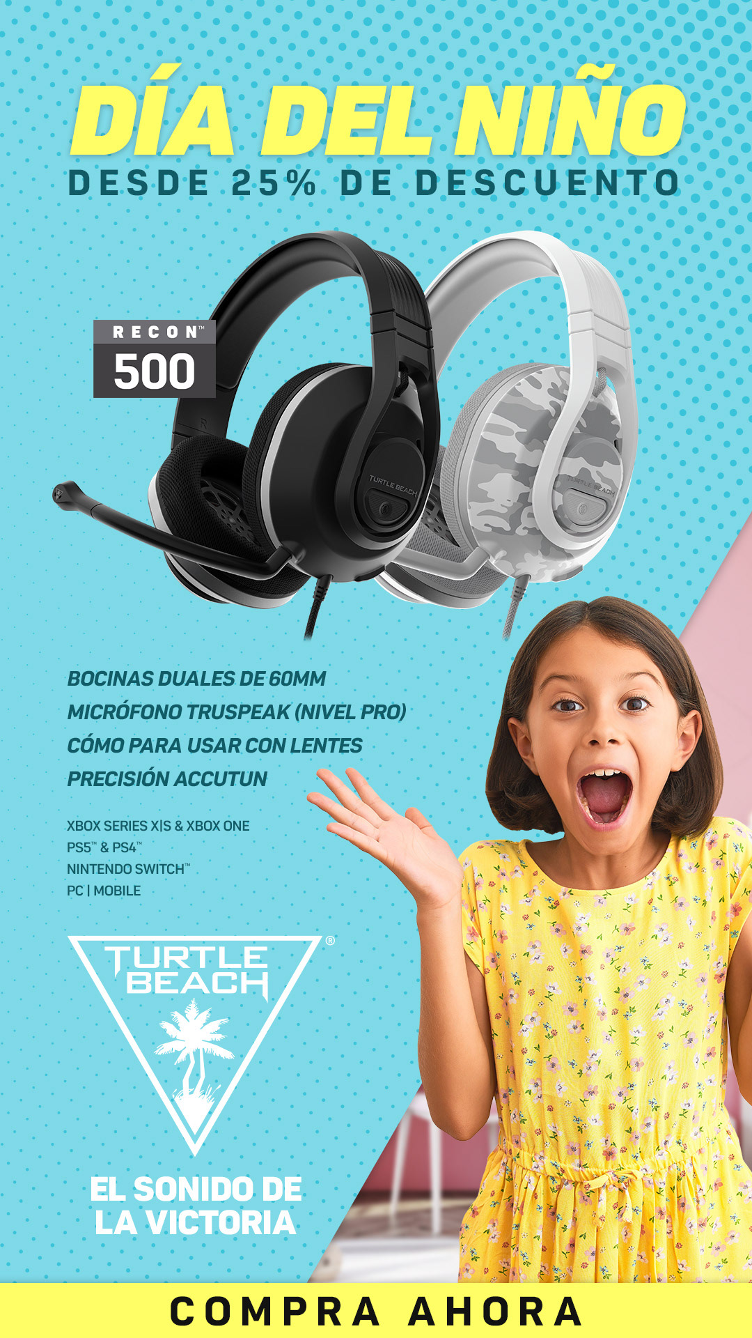
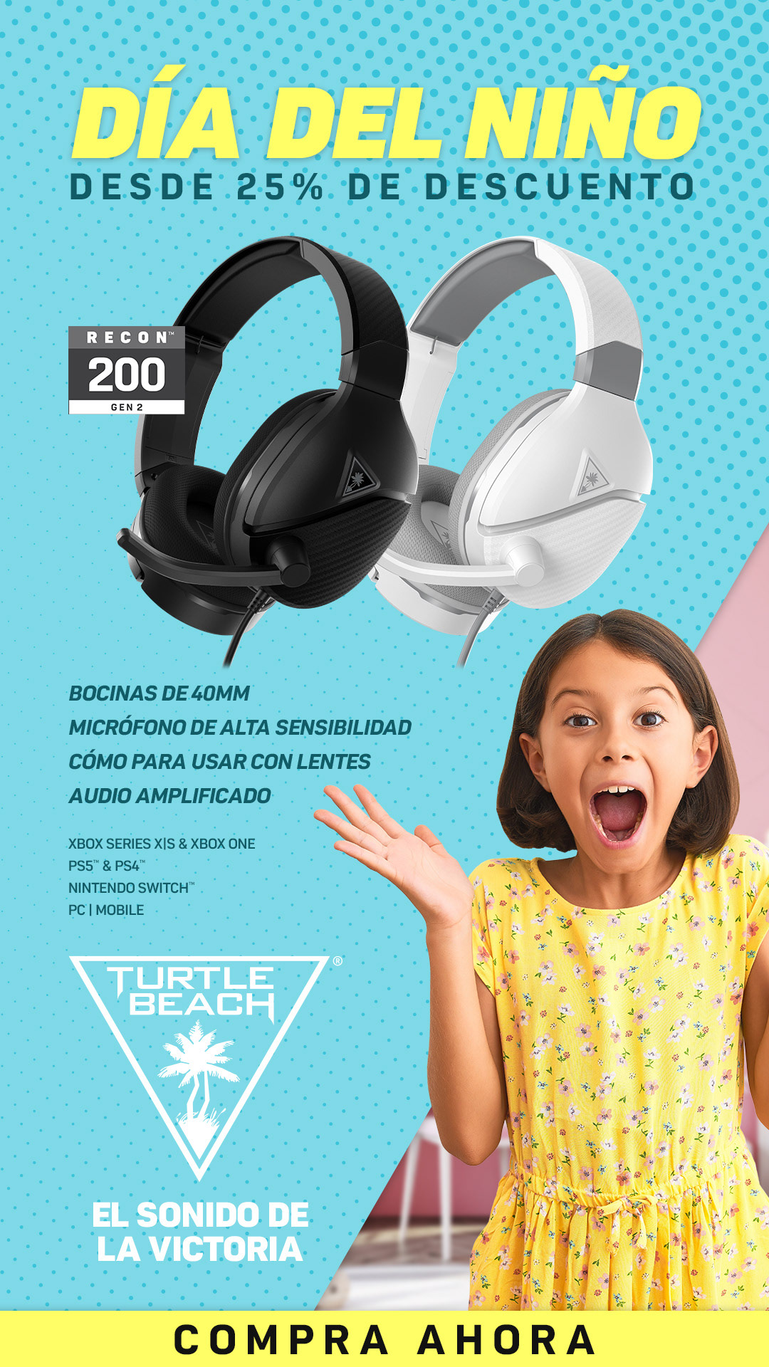
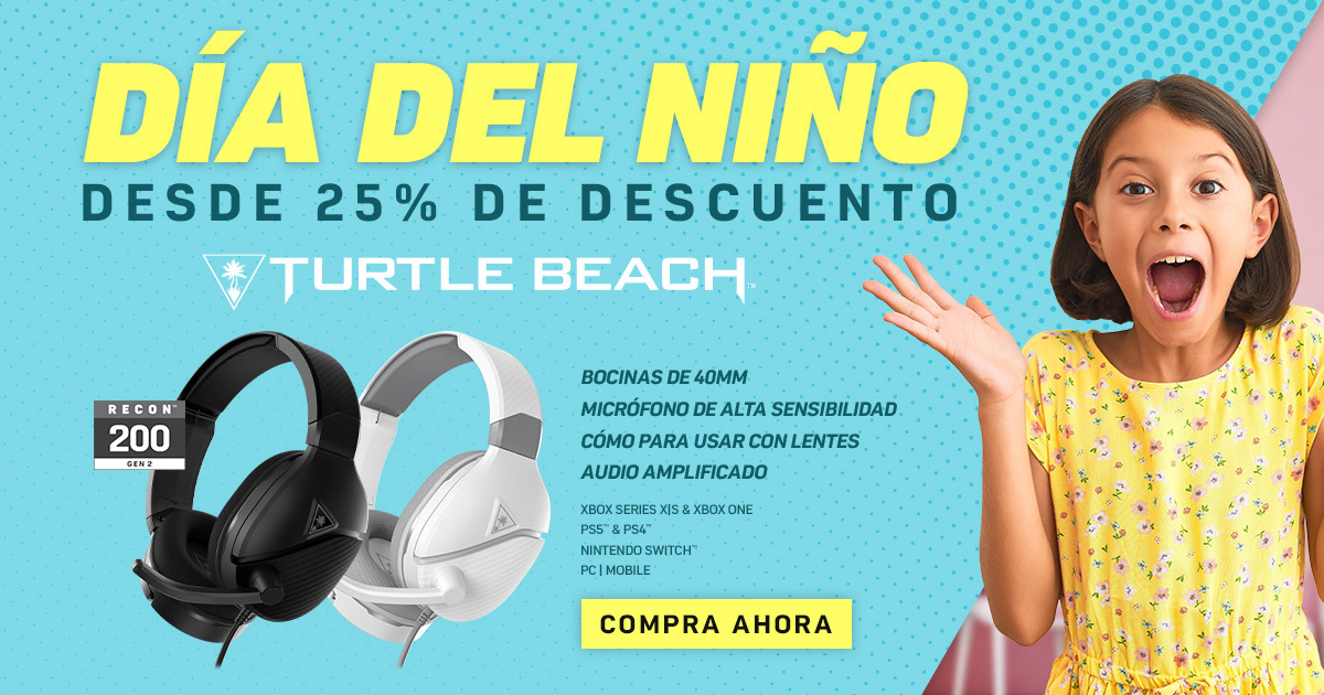
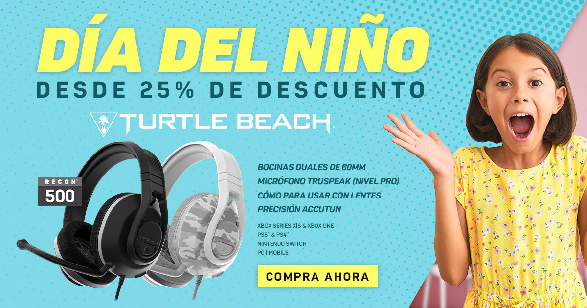
In addition to creating English assets, the creative team would often create ads for international parts of Turtle Beach. This offered a new set of challenges when creating ads, as many of the international offices had their own wants and desires for their ads. As seen here, Latin America (LATAM) would favor text-heavy ads and required a completely different approach when designing. The amount of sizes varied, with this set being one of the more complex.
2022 Holiday Campaign
The 2022 Holiday Campaign was an exciting project that I took the reins on and led the company through. My look was chosen by the executives out of the design team, allowing me to dictate usage and style. This was an awesome opportunity that allowed me to lead our global sales for the end of the 2022 year. These were translated into seven additional languages, used by our teams globally and were shown to be a success.
To ensure the design was easy to follow and used properly, I color-coded each type of asset.
Purple - Under $100
Blue - Under $50
Green - Bundles
Red - Miscellaneous
Purple - Under $100
Blue - Under $50
Green - Bundles
Red - Miscellaneous
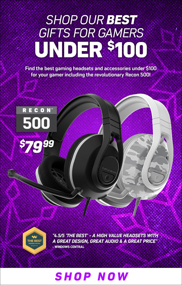
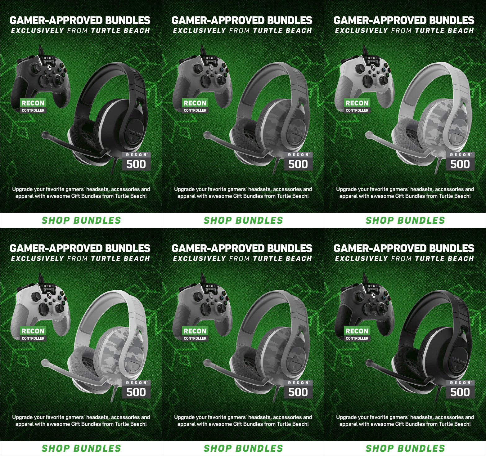
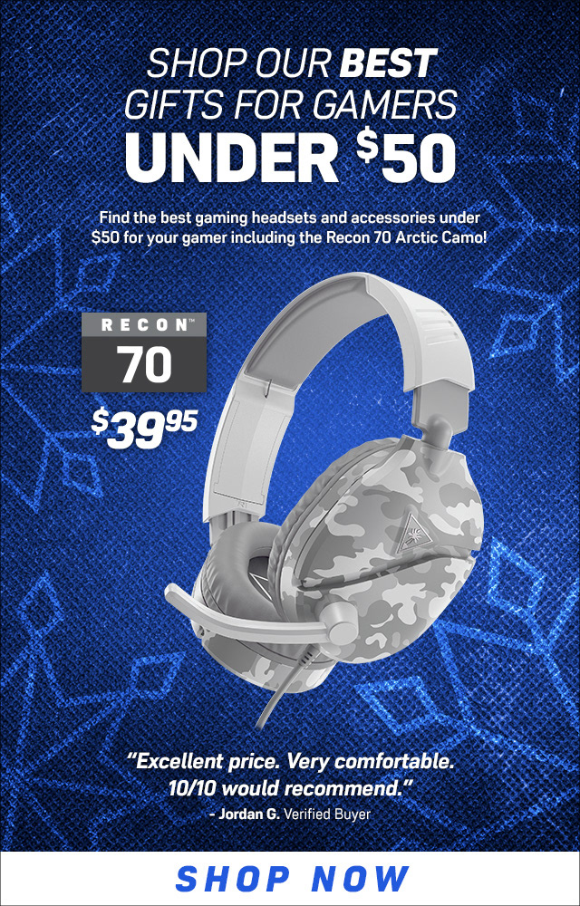
Emails
The emails were straight forward given the aforementioned system. When possible, I chose to use GIFs as it allows the content to breathe. Lastly, I kept content positions clearly defined so they could be easily templatized and used by other designers around the globe.
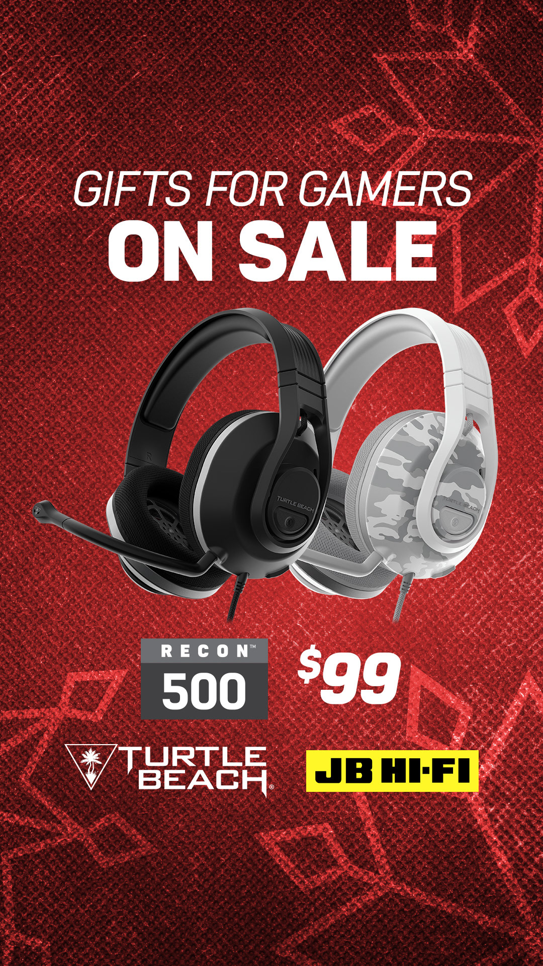
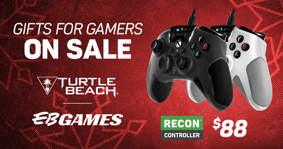


Digital Ads
As with all of our sales, plenty of social media posts were created showcasing all the deals. In addition, many retailer-specific sales occurred also using the holiday campaign. This meant plenty of assets had to be created. Here's a few that I personally designed.
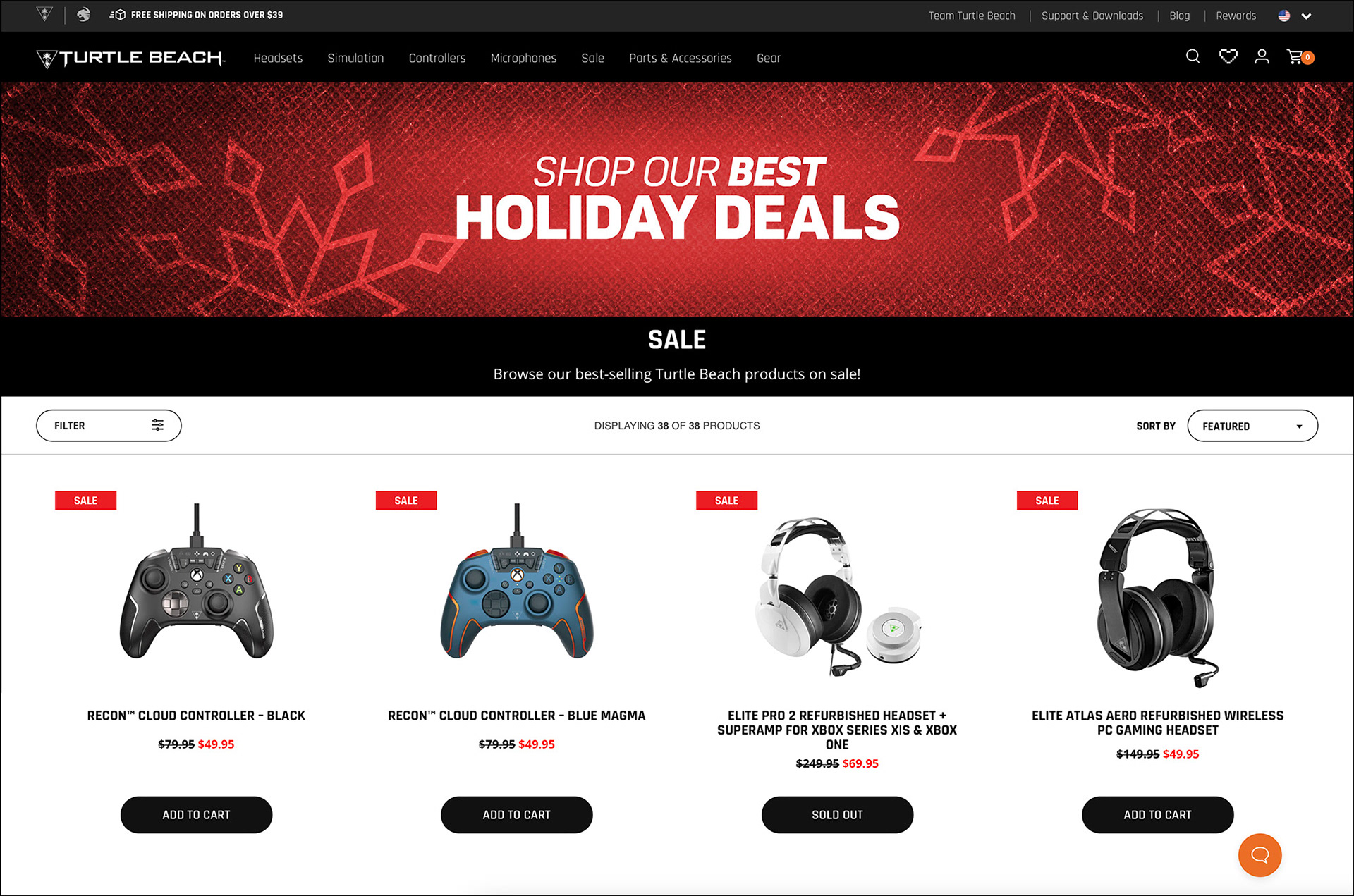
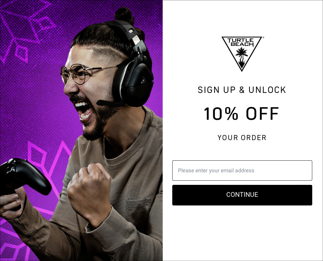
Turtle Beach Website
Among the miscellaneous collateral that came with this project, I designed some of Turtle Beach's website banners and popups using the holiday theme, as shown here.
