
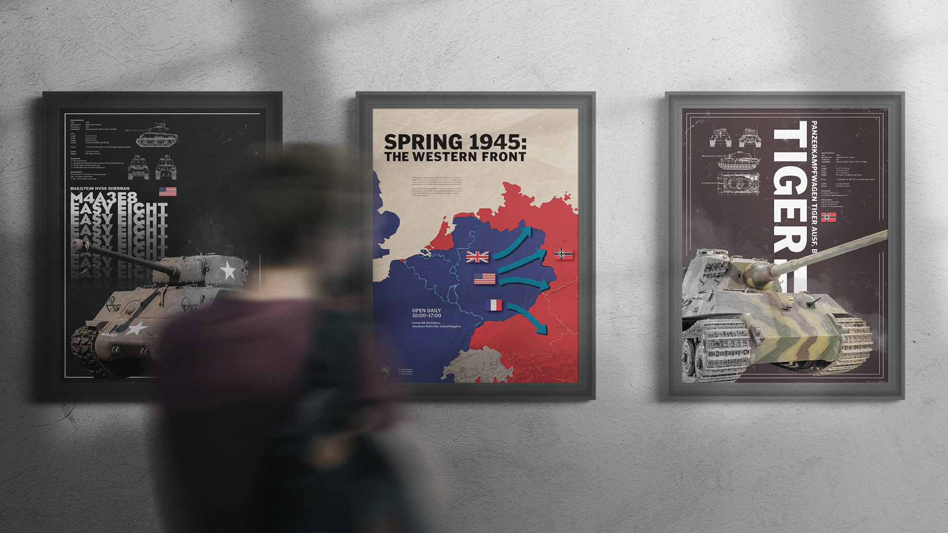
Spring 1945: The Western Front showcase at the Bovington Tank Museum. This fictional event takes many of the most pivotal and interesting vehicles used during the final months of World War II and presents them together in a unique new setting.
Initially I created the poster for the M4A3E8 Sherman 'Easy Eight'. I really enjoyed how the poster came together and decided at a later date to build on the theme by developing a three poster series.
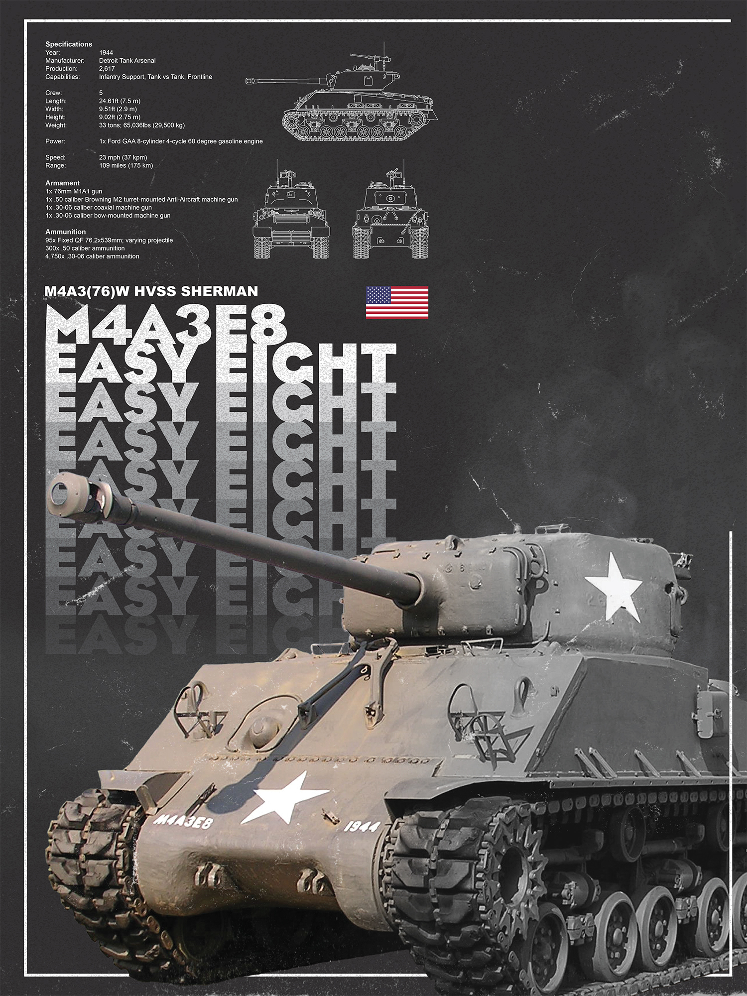
M4A3E8 Process
When creating this poster, I was originally torn between a blueprint concept or a poster concept. Both ideas focused on showcasing the unique features of the tank, however the blueprint idea felt too cliché and limiting. I proceeded forward with the poster.
The first issue to tackle was whether to depict the entire lineage of the tank, or just one variant in particular? For example, there were more than fifteen versions of the Sherman created by the United States alone. Should the poster reflect the versatility and adaptability of the line or just the penultimate version? After much consideration, I decided to pick just one variant of the tank as it allowed me to get more specific with the information, painting a solid picture of a single tank, rather than a broad stroke of several. Since the event focuses on the end of the war, I felt the poster would be most successful showing the final variant.
Once these essential choices were made, it was time to create the full poster. I modified an image of a Sherman tank to appear as if it is transitioning from black and white to color, bringing history to life. I replicated the nickname of the tank eight times not only to reflect the eight in the name, but also to subtly hint that the United States had the capacity to mass produce these tanks.

Map Process
This poster was created to serve both as the central poster, offering contrast, but also to be a standalone poster that could be placed where space was limited. It features all the key information associated with the battlefront, such as date, time, and a short synopsis of the event.
I knew early on that this poster would focus on a map from the time period. Proceeding with this idea allows the poster to differentiate itself from its companion posters. The map is from mid-April of 1945, that being roughly a month before VE-day and when the tanks represented in the other two posters were at full operation.
To keep the worn feeling from the other posters while also trying to create contrast, I used a defined paper texture overlay to appear authenticate without the ‘distraction’ of artificial wear.
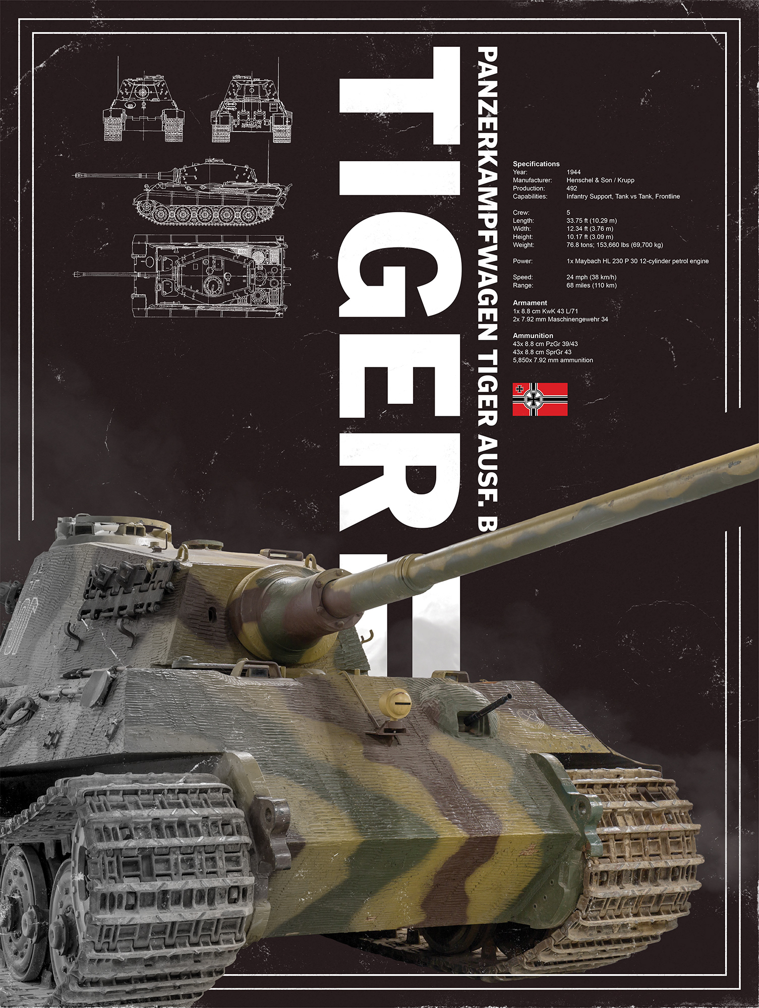
Tiger II Process
Creating the Tiger II poster was the easiest of the three due to the precedence set by the already complete Sherman poster.
The name of the tank was made very large to show the strength of the tank. The Tiger II was one of the most formidable opponents the Allies faced in the entire war. The front of the tank was impenetrable to many of the anti-tank guns being used by the Allies. This meant the poster needed to feel powerful. I chose a dense font with hard edges to show power. I rotated the II of the name to make the bottom appear sturdy, rather than unbalanced. Lastly, I made the tank cover the entire bottom left corner and bleed off the opposite side to give it an even larger appearance.
I picked a double stroked border for the poster, rather than the single stroke of the Sherman poster, because Germany put more resource into each tank. Other nations focused on mass production to achieve a strategy of attrition, where Germany focused on making every vehicle so advanced it was feared on the battlefield. Finally, I decided to modify the flag of Germany slightly just to remove an unnecessary swastika.