

Image Correction
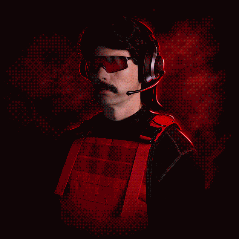
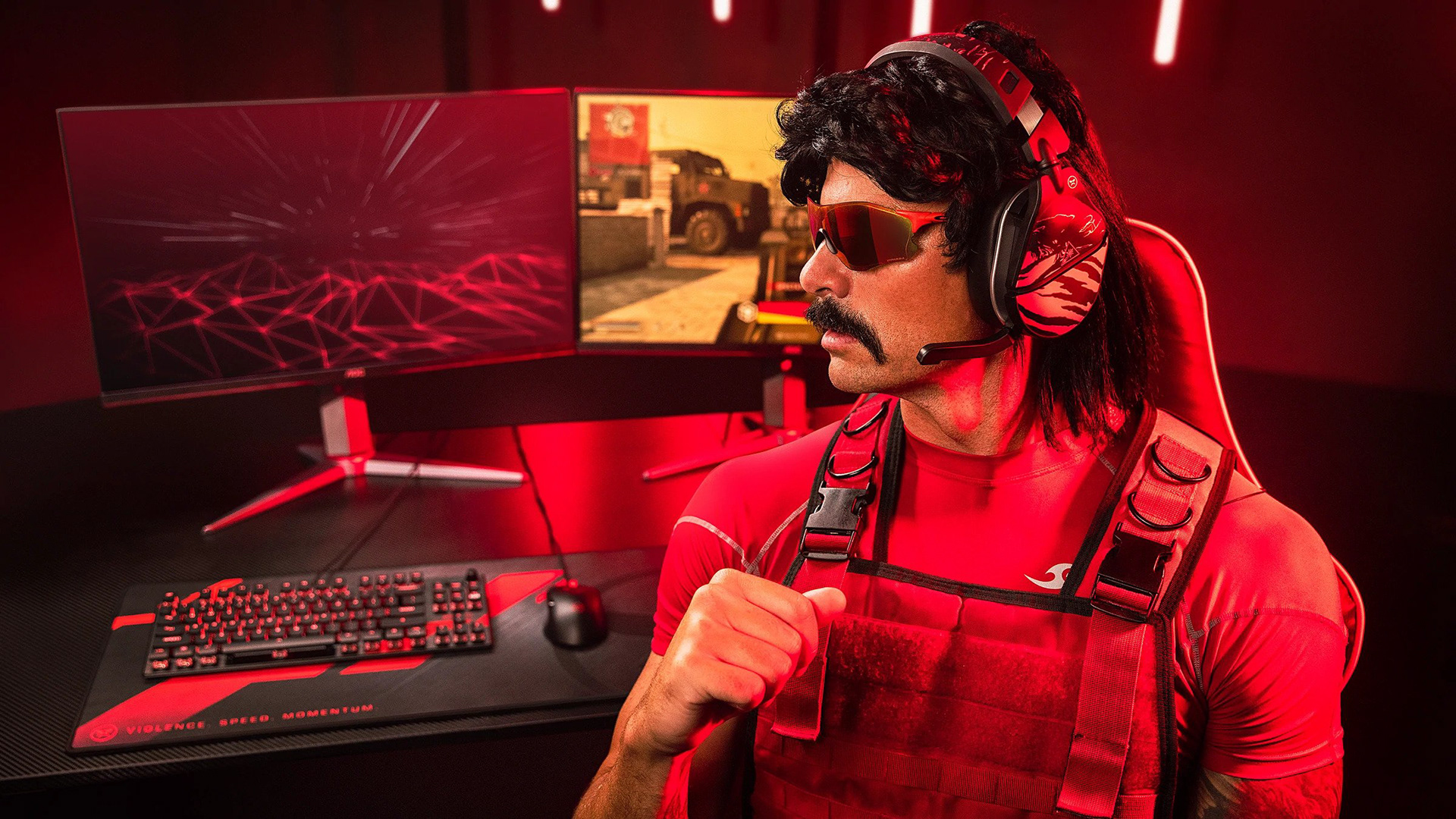
In order to get our photoshoot images ready for use, they had to undergo heavy editing. Here is a gif comparison of the before and after. I aimed to create an asset that fit within Dr. DisRespect's brand while keeping the focus on him and the headset.
Although the majority of corrections are obvious from the image, some of the smaller edits I had to make included extending his arms (due to the original image crop), covering his eyes, general color correction and extending the artboard to a square.
This was done at full size, so the asset is ready for use as-is wherever it is needed! In addition, two additional poses were created in this same style to offer variety.
Headset Design
Concept
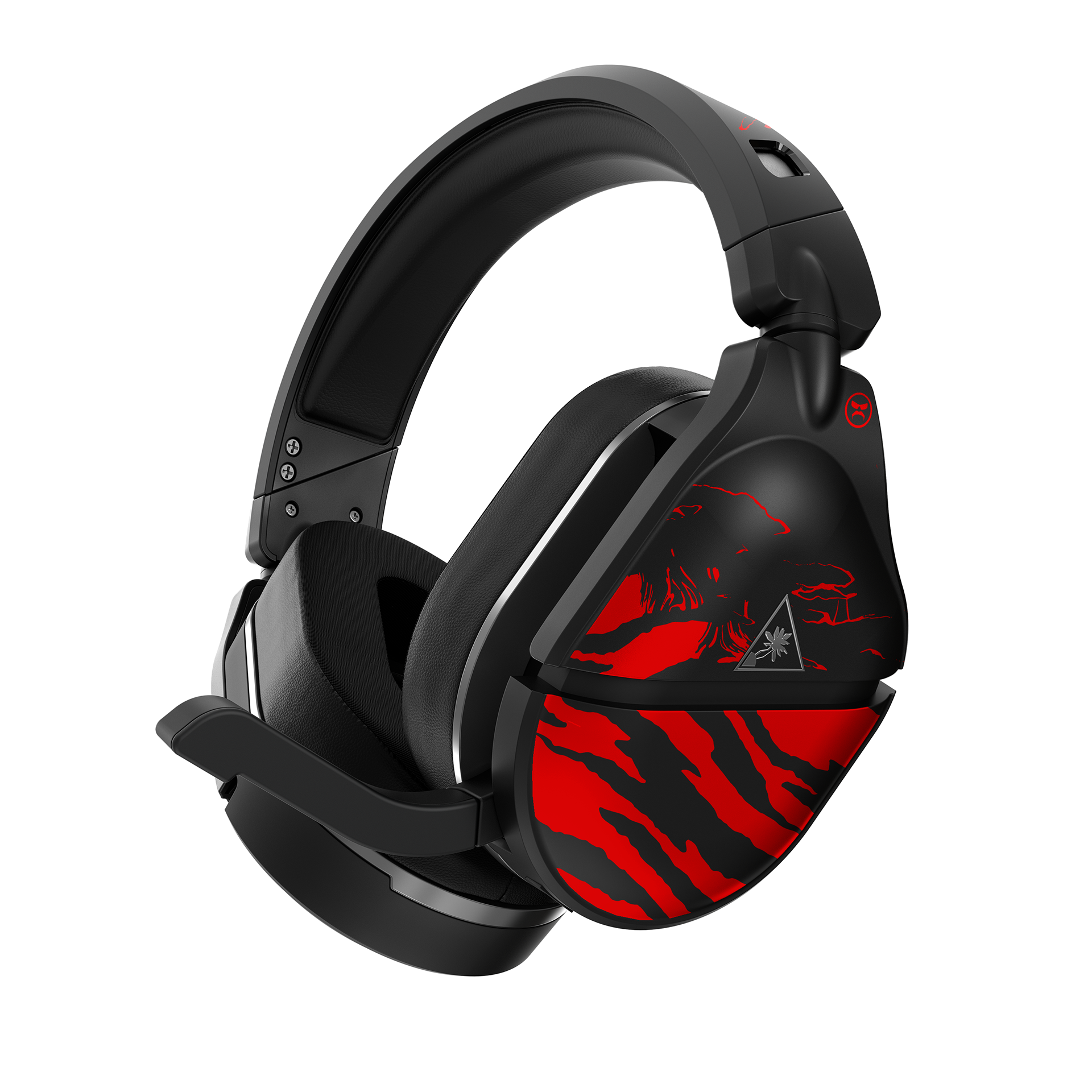
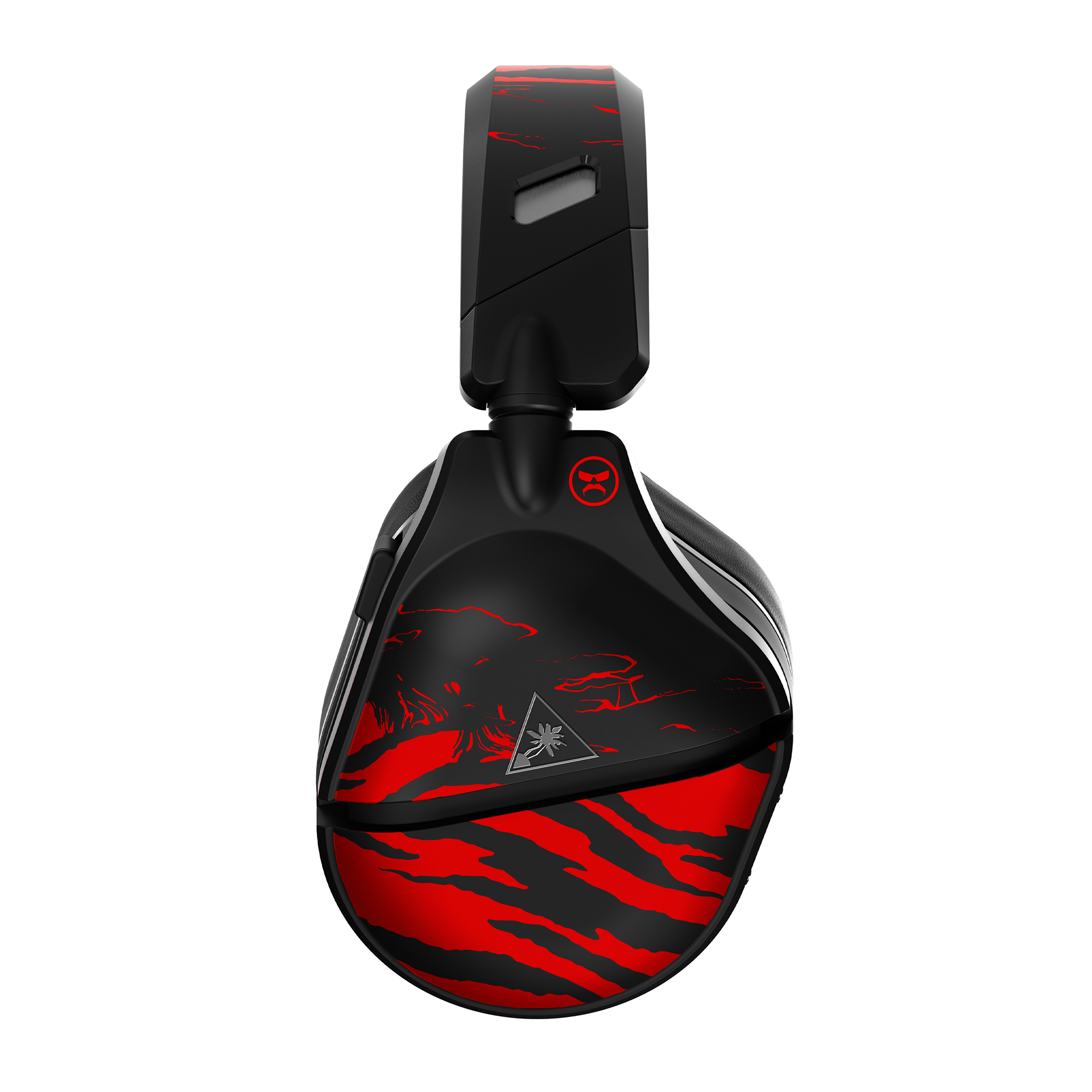
After conducting my research phase, it was evident that the Doc's brand entirely revolves around the '80s aesthetic. I didn't want to pull something too obvious and do triangles and grids, so I dug a little deeper. I landed on a tiger-like pattern for my throwback feel, but modernized the design to give it a more Dr. DisRespect feel. In addition, there were two additional concepts that were presented to Doc's team. My Senior Designer included a concept of his own as well, however it was not chosen.
We were constrained to only a few sections of the headset for applying design elements. Because of this, many of my early concepts had to be adjusted to fit.
After presenting the tiger design, it passed through approvals without changes and was accepted by Dr. DisRespect and his team, so we moved forward with production.
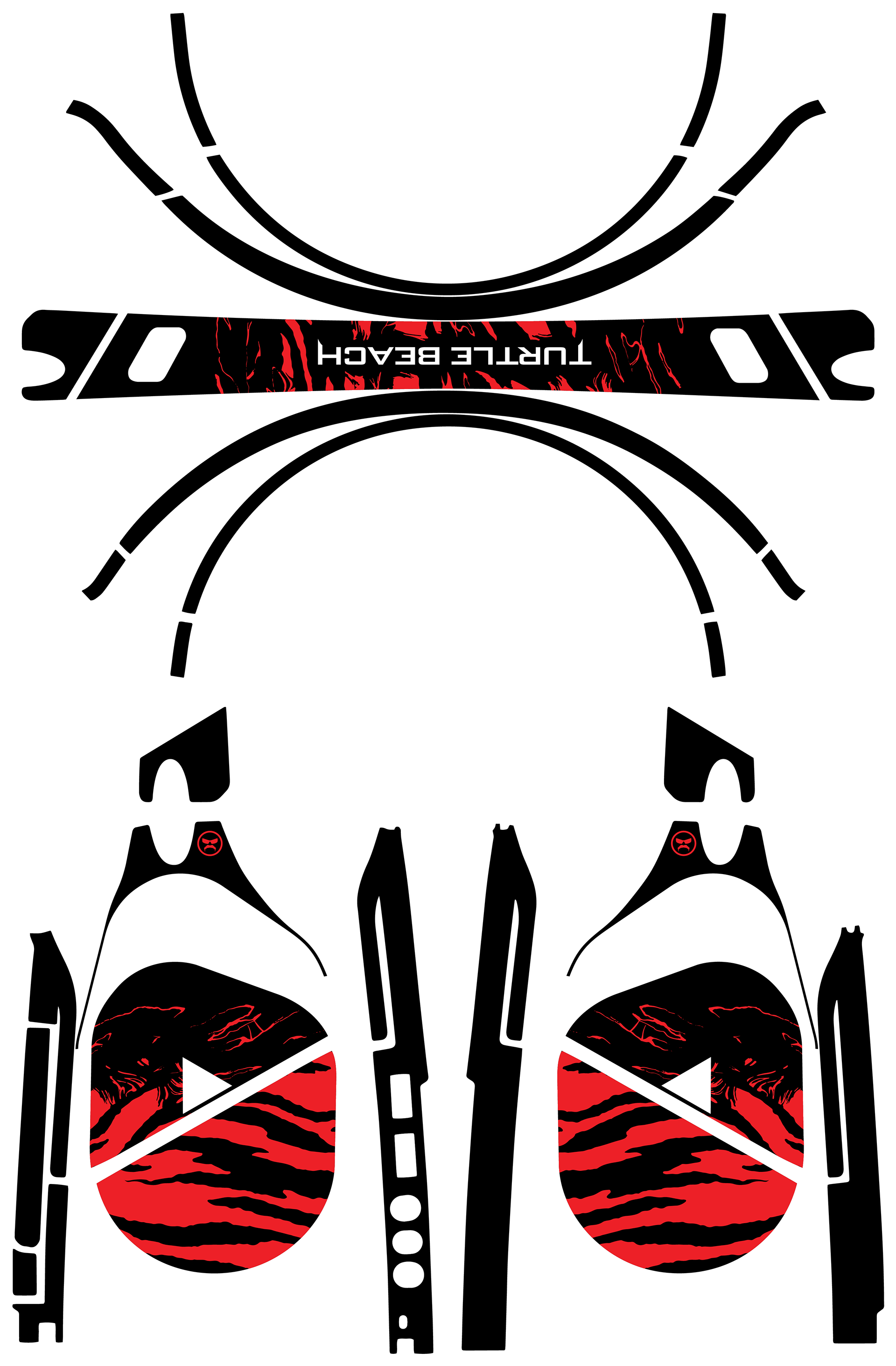
Eleventh Hour Edit
As the project continued, we received a sample that wasn't quite correct. The headband is engraved with the Turtle Beach logo and the then headband design was not adhering correctly as it was applied over the letters. My boss came to me and said we needed a new headband design sent out that day, and that it had several people that had to approve it too. She said she needed the new design in two hours.
The pressure was on, but I felt I already had my new idea. As you can see in the schematic image, I adjusted the headband art to be much thinner in size and look more like the logo is cutout from the pattern. This gave the logo engraving the necessary space it needed while keeping the style and aesthetic that was already created on the ear cups. The adjusted headband was completed in a little over an hour, and was fully approved without edits. The design then went on to full production.
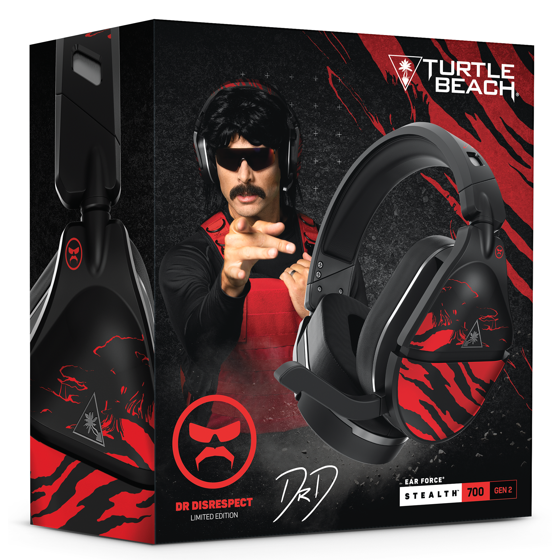
The packaging was created by my Senior Designer using some of the elements from the headset design and a mixture of existing packaging.
Once brought to market, the 2,000 headsets were sold out in under fifteen minutes!